0180: A Nod to Leafs History


Any good reason why the Maple Leafs shouldn't use these as their home and road jerseys? It's a nod to history while still quite modern. Another bang-up job by Nick Burton.

|
Any good reason why the Maple Leafs shouldn't use these as their home and road jerseys? It's a nod to history while still quite modern. Another bang-up job by Nick Burton.
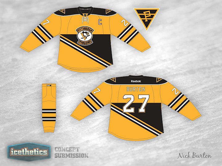
Maybe I should've saved this concept for Talk Like a Pirate Day, but that's still a couple of months down the road. Nick Burton has an interesting jersey offering for the Pittsburgh Penguins based on their Steel City NHL predecessor, the Pirates. This isn't the first concept we've seen from that era of the NHL in Pennsylvania...
You may recall a number of Quakers-inspired Flyers jerseys that started appearing when it was announced Philadelphia would host its first Winter Classic last year. This one by Jack Gambro was one of them. I'm reposting it here because I think it makes a good companion for the Penguins/Pirates look above. What do you guys think? Would these make for a great-looking game or what?
We're celebrating America's birthday with an Americans concept from Nick Burton. Enough red, white and blue for you? Enough stars and stripes? If not, check back for a Team USA concept scheduled for Sunday.
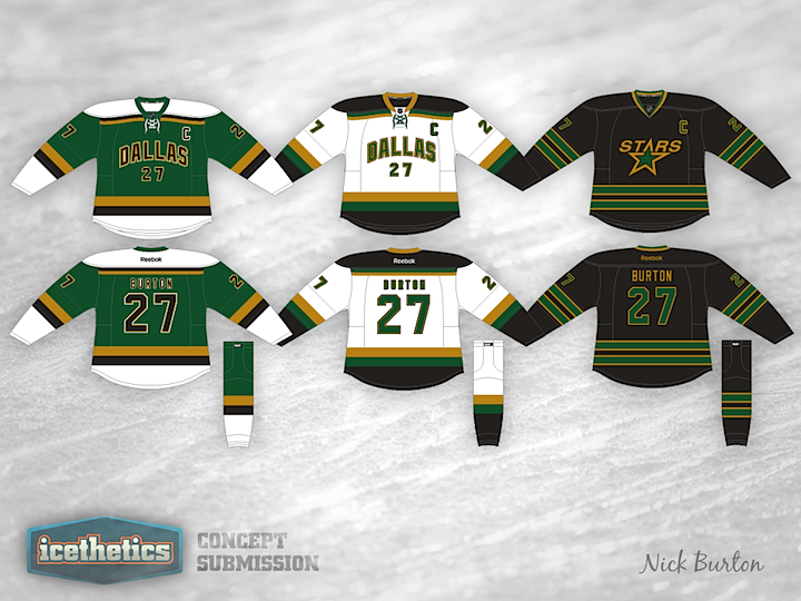
The Dallas Stars are the obvious final stop for Stars Week. Nick Burton's redesign is very much inspired by the old Minnesota North Stars. Seriously, is there anyone here that doesn't like this one? Great work!
Time for another theme week on the Icethetics Concepts page! During the Stanley Cup Final between the Kings and Devils, superstars solidify their place in the sport and new stars begin to shine. So we're honoring them with Stars Week. And who's best known for literal stars? The USA, of course. Here's Nick Burton's try at some pretty cool Team USA hockey sweaters. Olympics 2014?
By the way, I'm currently floating somewhere in the Caribbean Sea right now so this post was written a couple weeks ago. So at the time I'm writing, I have no way of knowing whether the Stanley Cup Final is over and the Kings drop-kicked the Devils in 5 or if Game 6 is happening tomorrow night. And obviously, being on a boat, I wasn't able to update this post before it went online.
We haven't really featured any national teams on the new Concepts page yet, so let's try one today. Nick Burton shares a new look for Team Canada with us. I'm a fan, but then I'm not Canadian. What do all you Canadians think of it? And if you guys have anymore international concepts to send in, maybe I can get another theme week going.
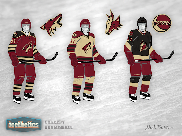
When the Phoenix Coyotes were rebranded in 2003, the simplistic design was a complete 180 from their original look. What Nick Burton seems to be doing here is trying to make the Coyotes look interesting again. He's brought back the old logo to use as an alternate and opted for the color palette of the team's current third jersey. It's not perfect, but I'd call it an upgrade.