Entries in rebourne (19)

Monday
Oct082012

0233: Predators Re-Bourne

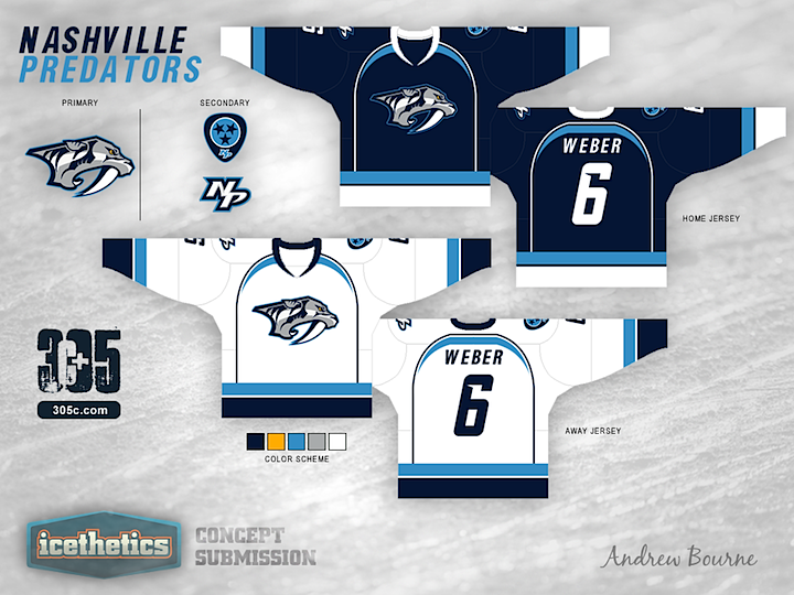
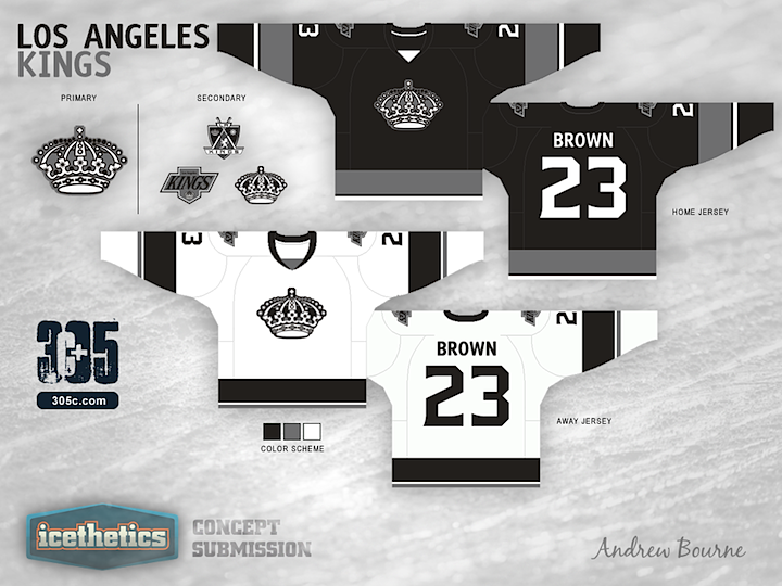
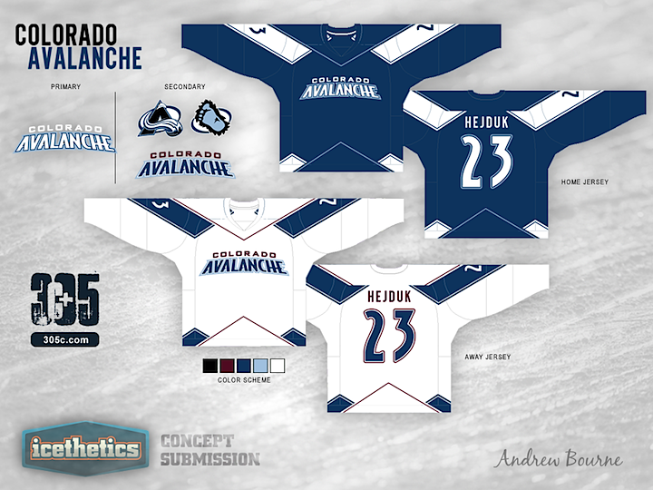
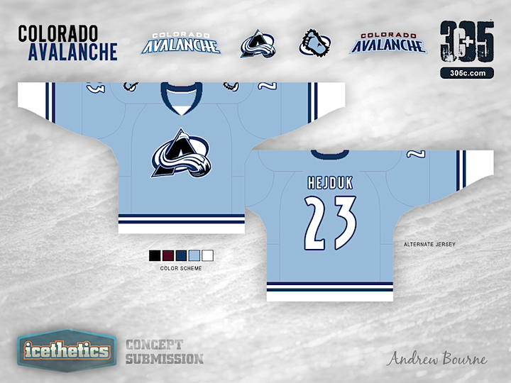
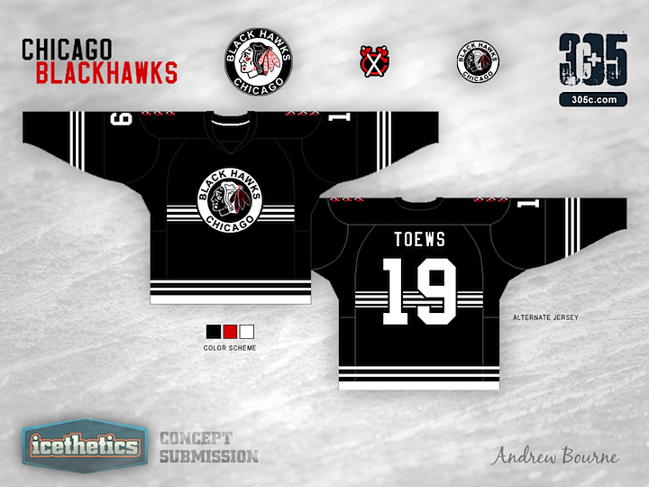
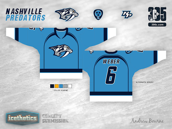
Concept artist Andrew Bourne has taken on the task of making over the NHL. In today's installment, he tackles the Nashville Predators. Hit or miss?

Monday
Sep242012

0219: Kings Re-Bourne

Andrew Bourne is back with the next team in his NHL makeover series. What are you thoughts on his monochromatic yet rather retro redo for the L.A. Kings?

Tuesday
Sep112012

0206: Panthers Re-Bourne

I realize Andrew Bourne's NHL series hasn't been the most popular thing on the Concepts page as of late but there's some neat stuff down the line that I think is definitely worth a look. (I might skip ahead of need be.) Today, he tackles the Florida Panthers.

Thursday
Sep062012

0201: Stars Re-Bourne

The next installment of Andrew Bourne's series of NHL makeovers features the Dallas Stars without a touch of green or gold in sight.

Dallas has one of the worst jersey sets in the NHL. The jersey is very plain and actually seems to try and mimic the jerseys of the main sport in Dallas, football. Although I understand that it is hard to get people to watch an unconventional sport in a warm city, there are other ways to grab a Texan's attention.

I wanted to utilize the Texas state flag (red, white & blue). Trying not to make a political team, I adjusted the red to a bit of a more deep red and the blue to be a bit darker than that of the blue on the US flag. I added yellow to the color scheme to try and have a feeling of a star. After all, the team is called the Stars. The yellow definitely gives the whole scheme a unique feeling and sets it apart from another patriotic color palette.

Thursday
Aug302012

0194: Avalanche Re-Bourne

Andrew Bourne continues his NHL makeover series today with a look at the Avalanche.

For the most part, Colorado's color scheme is right on the money. Their black, blue, burgundy, white and silver really remind me of Colorado. Cold and mountainous is the way to go. Having said that, I wanted to tweak those colors to give you more of a feel for the mountains and the snow.

Even though The Avalanche have the two best logos in the entire league, I decided to use them in the secondary role. The very modern look of the home and away jersey designs just didn't work with the rotated and angular A logo or the circular Sasquatch logo.

I also wanted to pay tribute to the Nordiques somehow in the third jersey. So, I took their simplistic style and added two stripes to symbolize, you guessed it, their two championships. The jersey is reminiscent of the Nordiques but still has a style that Colorado can call its own.

Monday
Aug272012

0191: Blackhawks Re-Bourne

It's been a while since we last saw an entry into the Re-Bourne series by Andrew Bourne. We pick it up with a very stripped-down set of jerseys for the Chicago Blackhawks. Thoughts?

Ask any hockey fan to name the top five best jerseys in the league. I bet Chicago will be on every list. Chicago has a classic style and is the class of the league. It is very hard to even try to improve their style, but I took a whack at it with a giant stick called, 'history'.

Thursday
Aug022012

0166: Flames Re-Bourne

Here's another set from Andrew Bourne, this time focusing on the Flames.

The Calgary Flames already have a solid jersey set, but there is definitely too much going on in the home and away jerseys. It's time to bring back some history to The Flames and really make them stand out as one of the best designed teams in Canada.