Entries in rebourne (19)

Saturday
Jul282012

0161: Blue Jackets Re-Bourne

The Re-Bourne series took a brief break during Minor League Week, but Andrew Bourne is back with his take on the Columbus Blue Jackets. He didn't send me a description on this one so you'll have to fill in the blanks on your own.

Tuesday
Jul172012

0150: Hurricanes Re-Bourne

Andrew Bourne's concept series continues today with a revised look for the Carolina Hurricanes.

What's wrong with the current red, black, white & silver scheme, you ask? Pretty much everything. The red does make sense in the fact that the flag warning system for indicating horrible weather conditions is red, but I'm not liking it. When I think hurricane, I think water and wind. Who first thinks of a red flag? Possibly people much smarter than I.

One year, I stumbled upon the hurricane toilet (in reference to the current Hurricanes logo). I actually kind of liked The Hurricane logo until I saw the toilet photo. Once you see something like that, you can't un-see it. So, I knew I had to do something drastic for The 305cHL Hurricanes. The primary logo is a mix of the Canes word mark and the swirling hurricane logo. I like the combination because you get a real sense of movement and you discourage the toilet...

Note: Sorry for the late post today. I didn't set my auto-publish date correctly. Better late than never though, right? Can't break the 150-day streak now!

Wednesday
Jul112012

0144: Sabres Re-Bourne

Andrew Bourne's recurring series marks another installment here with the Buffalo Sabres. I'll admit, even I'm a bit skeptical on this one, but I'm curious to see the feedback it gets.

Although my reasoning for The 305cHL Buffalo color scheme might be laughable, at least I have a reason. I decided to ditch the blue and yellow from Buffalo because there is a blue epidemic in the NHL right now: teams with no blue in their color scheme are finding ways to use it in their 3rd jersey. So, one less blue team certainly wouldn't hurt. I believe that the team was onto something during their 'red and black era'. They looked intimidating. What I didn't like was the brightness of the red with the high contrast of the black.

I kept the bright red as a very small accent color and brought in a burgundy to replace the black. The change from yellow to light gold was to hint at the sabre and gives a regal element to the design. Finally, the laughable part: Buffalo can never escape from what they are known for. Yep, that's right, Buffalo Wings. No, I didn't want this team to literally be a buffalo wing with orange, red and brown swirls of color, but I did keep in mind that this is what Buffalo is known for. So, I kept the colors warm (red and gold) and tried to hint - if only slightly - to the big Buffalo claim-to-fame... Laugh now or forever hold your peace.

Saturday
Jul072012

0140: Bruins Re-Bourne

Andrew Bourne's NHL makeover series continues today with the Boston Bruins. His comments about this design can be found below.

The current color scheme for the Bruins is black, gold and white. It is cool because you can say that you are rooting for the black and gold (which sounds way better than rooting for the brown and gold), but I believe that the Bruins should embrace their past and have one of the more unique color palettes in the NHL. Who else could pull off a brown jersey? No one, that's who.

I actually didn't change too much on these jerseys because I believe that the Bruins organization has gotten it right (as far as overall jersey layout is concerned). The small difference from the NHL layout to the 305cHL layout shows up in the striping and in the shoulder area. As far as the alternate jersey goes, The Bruins need a gold jersey that works. Gold is a rare color in the NHL (at least it was) and they need to embrace their uniqueness.

Monday
Jul022012

0135: Ducks Re-Bourne

I'm launching a new concept series today from artist Andrew Bourne. He asked if I'd feature his rebranding series, tackling the entire NHL. I told him I'm game so you'll start seeing his work here every few days, starting with the Anaheim Ducks.

Now, what Andrew's doing doesn't exactly fall under the category of "rebranding" in my book. He's changing colors and redesigning jerseys and so forth. Instead, I'm calling his series "Re-Bourne." Hope you get a kick out of it, as I have. Below and in subsequent posts you'll find Andrew's explanation of his work.

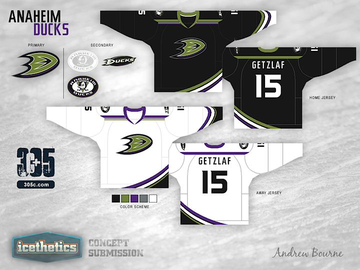
Although the orange streak in the current jersey format connects Anaheim geographically (Orange County), I'm not a fan. The orange is a bit too distracting in the Black, Gold and White color palette. It seems to really jump out and take all of your eye's attention. So, I decided to mute the colors a bit and return to a near replication of the Jade & Eggplant. The green is a bit darker than the original, less teal and more 'pond scum' green. The eggplant was tweaked to a more full purple which worked well with the black.

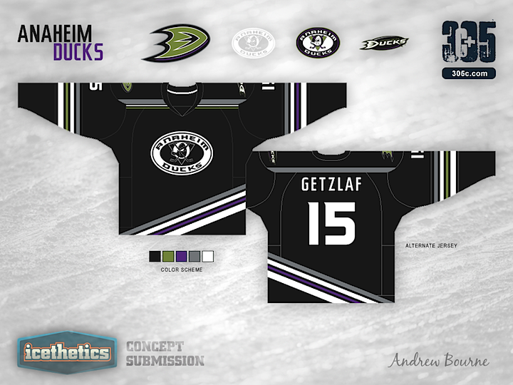
You don't see a lot of asymmetrical jerseys in the NHL, or AHL... or KHL for that matter. Why? Because they usually don't work. I can't say that my idea will work, but I believe that it could work. In the current jersey, Anaheim has a few curved stripes from left to right across the bottom. I liked that idea but I didn't like how it just stops on the left edge of the jersey, leaving a strange black area. The sleeves in the third jersey have a simple striping similar to the bottom, except one side has purple while the other has green. It gives the alternate sweater a sense of asymmetry without actual asymmetry. Make sense? Probably not...

Page 1 2 3