0609: Florida Fauxback Freak Out


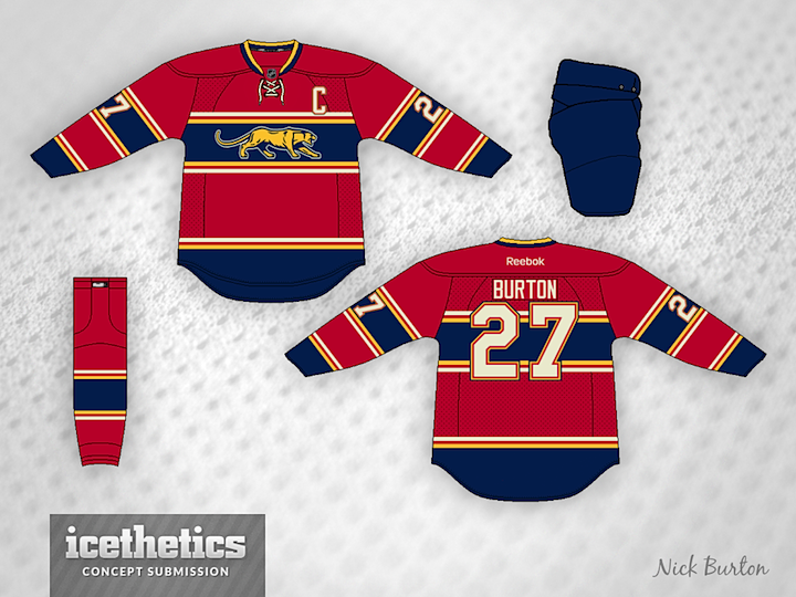
Maybe this Nick Burton design is what the Florida Panthers would've looked like 80 years ago. But since they've only been around 20, I'm a little freaked out. What do you think?

|
Maybe this Nick Burton design is what the Florida Panthers would've looked like 80 years ago. But since they've only been around 20, I'm a little freaked out. What do you think?
Red Week wraps up with this Canucks set from Rob Coulter. He wants to see Vancouver revert back to red, black and yellow — but he likes the modern Johnny Canuck logos. Thoughts?
By the way, I hope you guys noticed that during Red Week I made a concerted effort to feature some new designers. Five of the artists featured in the last six days are first-timers. Two weeks ago I had a theme week that featured a bunch of our prolific regulars, so I figured now would be a good time to squeeze in some fresh blood. Keep all the great concepts coming!
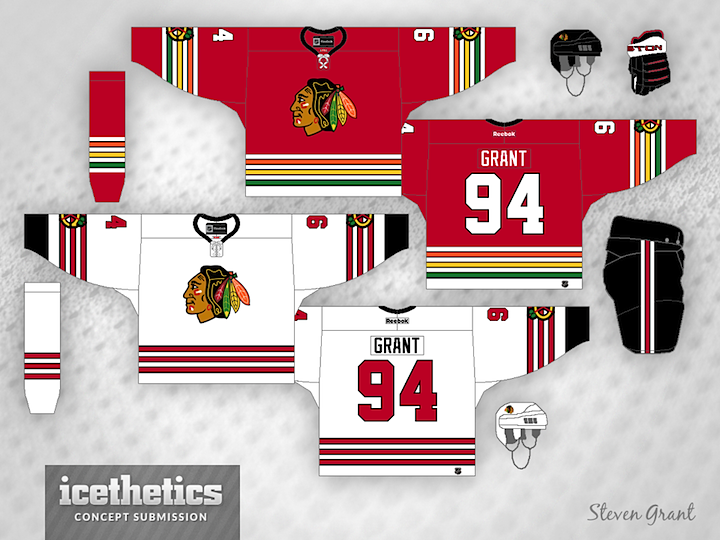
Steven Grant has been working on a series to "de-Edge" the NHL — returning the jerseys to the days before 2007 when Reebok changed some things. But I can't say I'm a huge fan.
Steven wrote, "I haven't seen many concepts for the Blackhawks that use the colours from the logo in the striping, so that's what I tried here."
Earlier this week we heard from the Islanders regarding their uniforms for their impending move to Brooklyn. They said the blues and whites will remain the same but a new third jersey is on the horizon. So that validates all the silly black-and-white numbers I've been posting on Freak Out Fridays for the last several months. This one from Matt Andersen is another that made me chuckle.
I don't even want to explain why this 2015 Winter Classic concept by John Elbertson belongs on a Freak Out Friday. It's more fun if you look at it a minute and realize on your own.
Two Freak Out Fridays ago, I shared a couple of concepts from my childhood — proving that my fascination with this part of hockey goes back a very long way. But enough of you were amused by my scribblings that I thought I'd offer up another set. I wouldn't call this a concept, though, so much as a hand drawing of the Islanders' fisherman jersey. As a kid, I thought it was the coolest thing. Now? Well, let's just say my tastes have changed somewhat.
I'm sure you're wondering what in the world this is. My youngest brother Mark, who was eight years old at the time, was captivated by the two newest teams in the NHL — the Hurricanes and Predators. So much so that he created a Franken-jersey, mixing the two together. Unfortunately, he did it backwards because I would've been more interested the saber-toothed hurricane (Syfy movie idea!) than whatever this is. But cut him some slack. It was a lot of years ago.
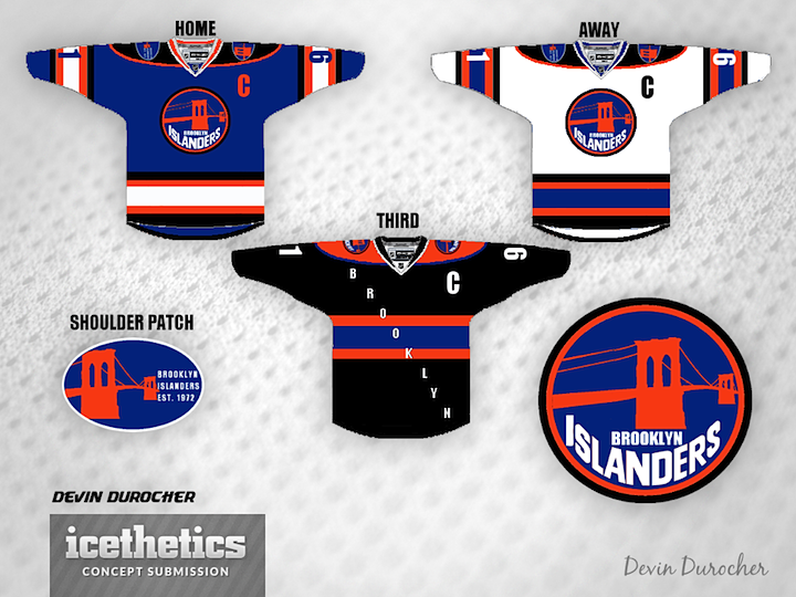
You wouldn't believe the number of Brooklyn-based Islanders concepts I've gotten since the team announced it was moving. Some good, some bad. But every once in a while I come across one I really have to share. Devin Durocher's is one of them. I can't decide if it's one of the best things I've ever seen or one of the worst. Either way, I thought you should see it.