Entries in freak out friday (94)

Friday
Aug162013

0545: Freak Out Flashback

I warned you it might come to this. Given the recent popularity of the handmade concepts from Morgo Uxbridge, I thought I'd dig up a little something from my childhood. If you want to know how far back my love of hockey jerseys goes — well, here you go.

The drawing wasn't dated, but I'd say I was in the neighborhood of 11 or 12 when it was made. Not that I was an artist by any stretch. And please don't ask me why it says "REX" on the back. I couldn't possibly tell you what was in my head 20 years ago. But at least you can see I was always a fan of the Whalers' superb logo and uniforms.

And about those "victory stripes" under the arms... it's not an homage. Growing up a Lightning fan and seeing them on our jerseys, I just assumed it to be a standard feature on all hockey sweaters. Didn't realize until years later that it was something special only Tampa did.
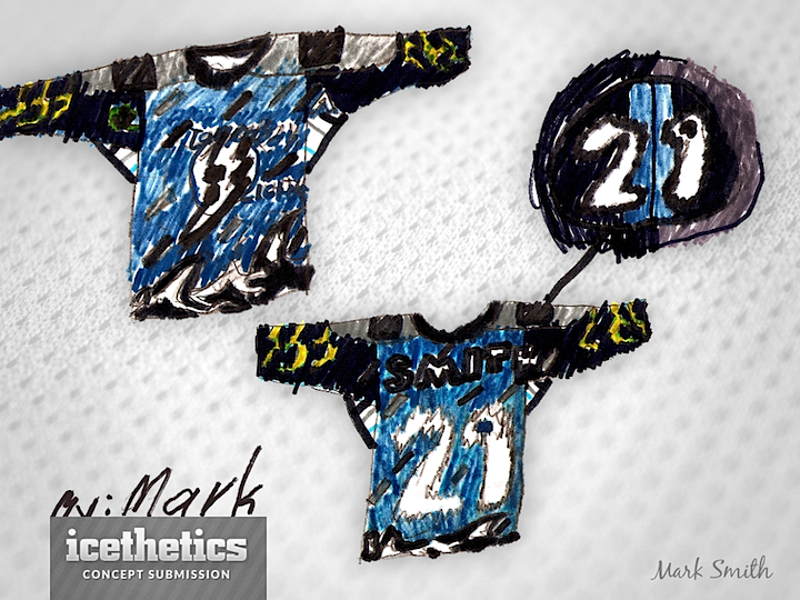
Speaking of the Lightning, my brother Mark is six years younger than me and, I believe, drew this around the same time as the one I made above. That would put him at about 5 or 6 years old so you can understand the crudeness. He's since become a very talented artist in his own right. But my brothers and I were fascinated with the Bolts' storm jersey when it was released in 1996. We thought it was way cool compared to the boring stripes of the primary jerseys. But what did we know?

What do you guys think? There's more where this came from. I just unearthed my take on the NYI fisherman jersey as well as a mash-up Mark did of the Hurricanes and Predators in 1998, when they were there new teams on the block.

By the way, feel free to say you hate this and I won't post anything more. I just thought it was funny digging up this old stuff. And hey, if you have anything like this to share, please send it along.

Friday
Aug092013

0538: Blue and Gold and Out There

I'm fairly sure this is a good example of what not to do with an NHL uniform. I like the attempt at a white-free design, but I'm afraid Marshall Dunlap has created a patchwork quilt more than a hockey sweater. But I may be alone. What do you make of this Friday Freak Out?

Friday
Aug022013

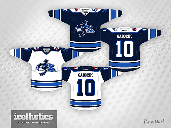
0531: Blue Jackets Freak Out

For this Freak Out Friday, Ryan Yuck mixes eras in Columbus. Check out that crazy crest.

Friday
Jul262013

0524: Buffalo No-Go

We end the week where it began: Buffalo. This concept by Bryan Dyck sort of walks the line in terms of Freak Out Fridays, though. It's not a bad design and strictly speaking it's not even that far into outer space. But the number on the chest and the oversimplified crest are not quite my cup of tea. Interesting idea, but I don't think it should be NHL-bound.

Friday
Jul192013

0517: Music City Freak Out

This one's a pretty good freak out. Jonathan Pelton apparently like stripes. And single-digit sweaters. But in fairness to Jonathan, he says his goal was to implement the old style striping of hockey sweaters into a more modern design. Probably should keeping trying.

Friday
Jul122013

0510: Vancouver Freak Out

John Elbertson has mixed multiple eras of Canucks logos with a jersey style not unlike the Blackhawks' in what appears to be an effort to simply freak us all out a bit. Mission accomplished. That said, this isn't all bad. Nor is it all good, but there's something about it I don't hate. What do you think of it?

Friday
Jul052013

0503: Canadiens Freak Out

Cards on the table, weird week. First, I forgot about Canada Day on Monday and posted a Mighty Ducks concept instead. (Sourry aboat that.) Then the Coyotes deal passed in Glendale Tuesday canceling my idea of running some Seattle concepts the rest of the week. Then I remembered yesterday was the 4th of July so I grabbed a last-minute Americans concept. And I thought I'd make up for missing Canada Day with a Canadiens concept today. But it's Friday, so this happened. Ryan Yuck has done some things to the Montreal Canadiens' logos and uniforms. But try not to freak out. Happy Friday.

Page 1 ... 2 3 4 5 6 ... 14 Next 7 Concepts »