Entries in new york islanders (39)

Tuesday
Dec182012

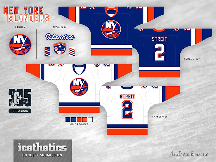
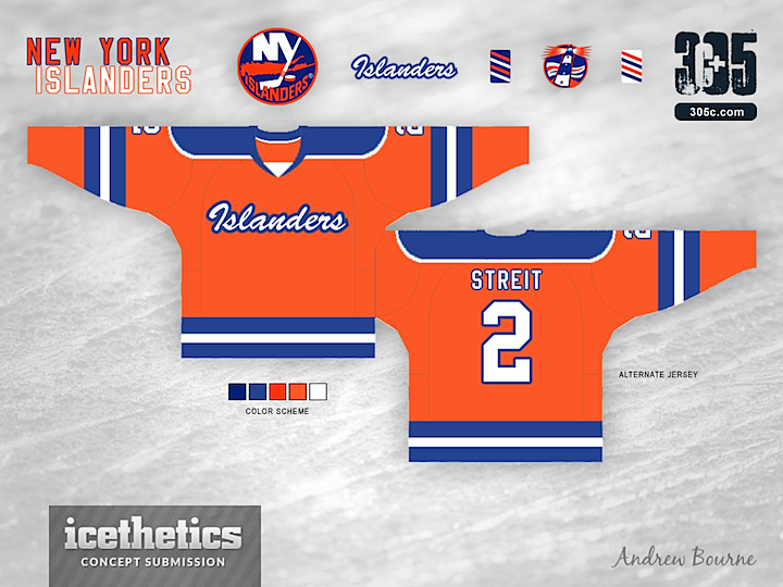
0304: Islanders Re-Bourne

We're close to wrapping up the Re-Bourne series. The Islanders are the 19th team that Andrew Bourne has taken on since he started with the Ducks back in July. I doubt he'll do all 30 NHL clubs, but it's certainly been an interesting ride. What do you think of this set?
Saturday
Nov172012

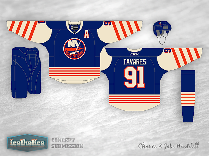
0273: Waddell's Winter Classic, Part 2

I debuted a new Winter Classic series by the Brothers Waddell last week. Chance and Jake have designed retro-style sweaters for all 30 NHL teams. We started with the Kings and Penguins. Then the first to comment on that post got to pick the next two teams; Brian chose the Rangers and Islanders. (Unfortunately, that meant posting three different Islanders concepts this week. But I'm keeping my word.)

Same deal this week. Which teams should we look at next Saturday? Be the first to comment.

Friday
Nov162012

0272: Long Island Freak Out

Ross Taylor is back on Freak Out Friday. Today he's looking at the Islanders and what might happen if they followed their new fellow tenants at the Barclays Center and changed up their color scheme. You'll notice a bit of a callback to this design from back in March.

Tuesday
Nov132012

0269: Coming Soon to Brooklyn

If the Stars are the most popular team to design concepts for these days, the Islanders have to be second on the list. There are a lot coming in lately. (In fact, you'll see another one on Friday. A fun one from our buddy Ross Taylor.) But this one by Brendan Klein is asking for a little recognition of Brooklyn — where the Isles will start playing home games in a few years. He's also got a neat set of jerseys which I'm really enjoying, by the way. This is a great kit, even if I don't quite get the secondary logo.

Friday
Oct192012

0244: Long Island Freak Out

Will the New York Islanders move to Brooklyn? If it does happen, Joe Lomma has a suggestion for how to change the logo. Just don't freak out about it.

Monday
Aug132012

0177: Four Stripes on the Island

I think this is a very cool and inventive New York Islanders concept by Justin Cox. We haven't seen one quite like this before. I like the stripes but the biggest problem I foresee is in the striping itself. These groups of four stripes were created on a patch for a purpose — to celebrate the club's four Stanley Cups. So what happens if they win another? Change the uniform again? That could get old if the team ever got good. Regardless, I like the anchor. Seems like anchors and lighthouses would be great symbolism for the Isles but they just don't seem to be interested.

Tuesday
May292012

0101: Lighting the Way

According to the Islanders, their black third jersey is here to stay for a while. But the most common complaint I've heard, beyond the fact that it's black, is that it doesn't have a logo. And what could be a better logo for this team than a lighthouse? Kevin Dion set out to design a black alternate for the Isles with that in mind. And the best part is that the team already has a lighthouse logo in its history. But it's been overshadowed by the frozen seafood character that was placed on the front of the jersey. I'm guessing it won't be popular simply because it's black, but I think it actually works as a third color for the Islanders. How about you?