Entries in new york islanders (39)

Saturday
Mar162013

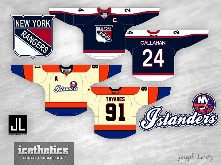
0392: Battle of New York

Last week, we got a look at a Winter Classic starring the clubs from Pennsylvania. This week, Joseph Loretz provides a New York-based game between the Rangers and Islanders. And like any good Winter Classic, there's some unnecessary vintage white in there for good measure.

Friday
Mar012013

0377: Two Blue Freak Out

On Tuesday, I acknowledged the abundance of Isles concepts on these pages and offered up an example of a good one. Today, for Freak Out Friday, we hit the other end of the spectrum. Andy Bugelli seems to have a better handle on manipulating NHL video game software than designing hockey sweaters. Still, what do you think of the Islanders in a lighter blue?

Tuesday
Feb262013

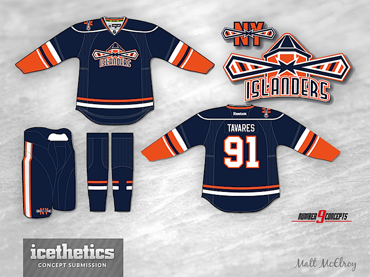
0374: Long Live the Lighthouse

I know the Islanders get featured here an awful lot, but a good concept is a good concept. And this one by Matt McElroy is very good. I don't know why the Islanders have never tried to pursue a lighthouse logo again. Did the 1995 rebranding debacle leave such a bad taste in everyone's mouth that they dare not suggest anything good might have come of it? A third jersey would've been the perfect place to test the waters of a new secondary logo. Instead, we got text on a black jersey — the two biggest no-no's in the third jersey world.

Friday
Feb222013

0370: More Monochromatic Isles

Some designers can't get enough of the idea of the New York Islanders switching to a black-and-white color scheme when they move to Brooklyn in a few years. They're not the Nets, but that's not stopping anyone. Here's another from Ian Black that I liked enough to include on this Freak Out Friday.

Friday
Jan042013

0321: Black Brooklyn Freak Out

It might not be ideal but I couldn't help but share this one on a Freak Out Friday. Dawson Elliott came up with this Islanders jersey after he heard the team will be moving down the island to Brooklyn.

Wednesday
Dec262012

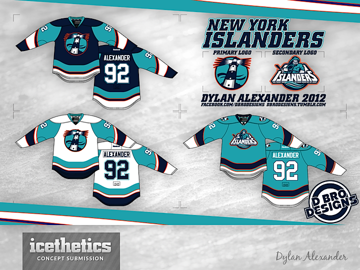
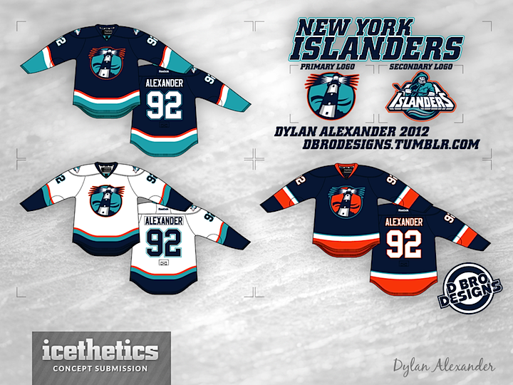
0312: The Lighthouse

Got another interesting take on the New York Islanders today. Dylan Alexander used the old logos from the mid-90s and swapped the colors around a bit. What do you think?

Thursday
Dec202012

0306: Black & White Isle

I used to think there was no way to design a good hockey sweater using only black and white. I changed my mind today. This New York Islanders concept by Thomas Hopkins is inspired by the decision of the NBA's Brooklyn Nets to adopt this simple palette when they moved into the building they will soon share with the Isles. (End run-on.) Needless to say, I'm a fan.