0120: Go Team Latvia!
Jekabs Elerts has been putting together a series of international team uniform concepts. His first being featured today is Latvia. Fun new concept series starts tomorrow!
|
Jekabs Elerts has been putting together a series of international team uniform concepts. His first being featured today is Latvia. Fun new concept series starts tomorrow!
Jersey design voting for the IceHL Project's final division ended last week but today we get a look at what might've been. Johnny Woods wanted to enter this design for the Regina Renegades but couldn't come up with a white counterpart that worked. I told him this might be a good submission for the third jersey contest that we'll hold next summer, but he wanted to see it on the site sooner to get some feedback. And I agreed. Thoughts?
Ross Taylor has another couple of brand-blended logos to share with us. On this Freak Out Friday he's mixing the NHL and WHA franchises of Toronto and New Jersey. The Toronto Maple Leafs and Toronto Toros have been combined just as the New Jersey Devils and New Jersey Knights.
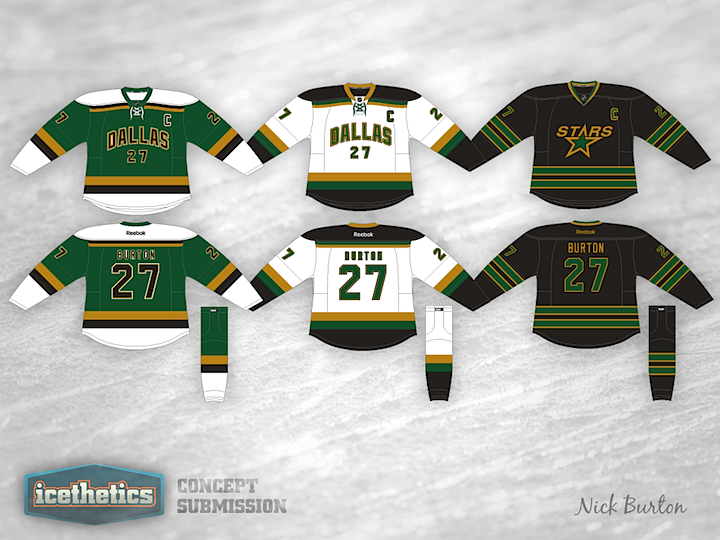
The Dallas Stars are the obvious final stop for Stars Week. Nick Burton's redesign is very much inspired by the old Minnesota North Stars. Seriously, is there anyone here that doesn't like this one? Great work!
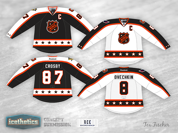
We can't have a Stars Week without getting the All-Stars involved. And with all the new throwback jerseys being introduced across the NHL over the last few years, it would be easy to see the All-Star Game getting that same treatment. So Tex Fischer put together these retro-style all-star uniforms. The last time the league used orange and black sweaters was 1993. And they'd done so for 20 years. Bring 'em back!
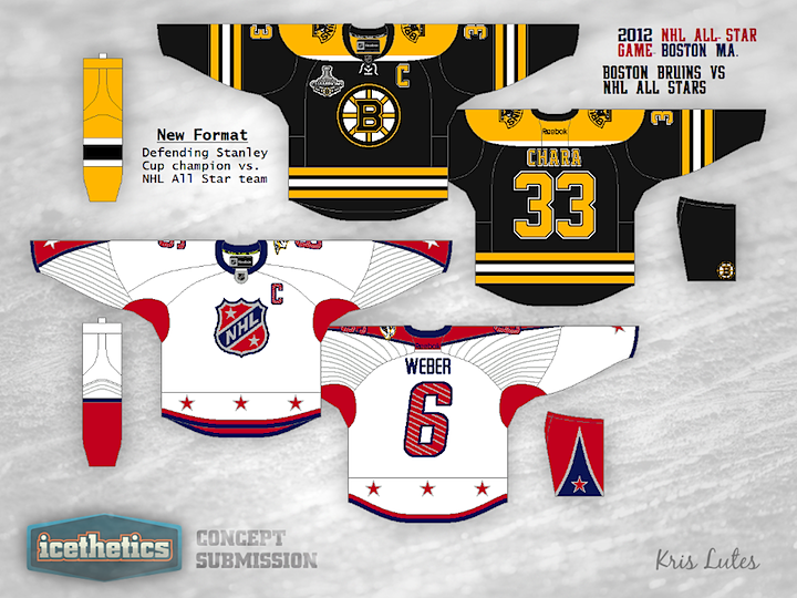
Now this one I probably should've posted a long time ago, but it just got lost in the shuffle. And as I mentioned earlier this week, I'm on vacation and this post was written a couple weeks ago. Therefore I have no way of knowing if the Stanley Cup has been awarded of if the epic Game 7 is happening tonight. Anyway...
Kris Lutes wants to see the defending Stanley Cup champion not only host the All-Star Game but also face the best players from around the league for one awesome match. Theoretically, this would be very cool. In actual practice, not so much. First, you already have players who see the ASG as a punishment for being talented. They don't like having to spend a whole weekend working in another city while less-talented players get a week off to spend with their families. And now an entire team is forced to go without rest. Plus, show me a Stanley Cup champ that's still comprised of the same players in January of the following year. Good luck.
So while it's a fun idea to think about, it just wouldn't work. But what do you think of the jerseys? Pretty sharp, no? I would say maybe do a little something more starry with the defending champ's jersey.
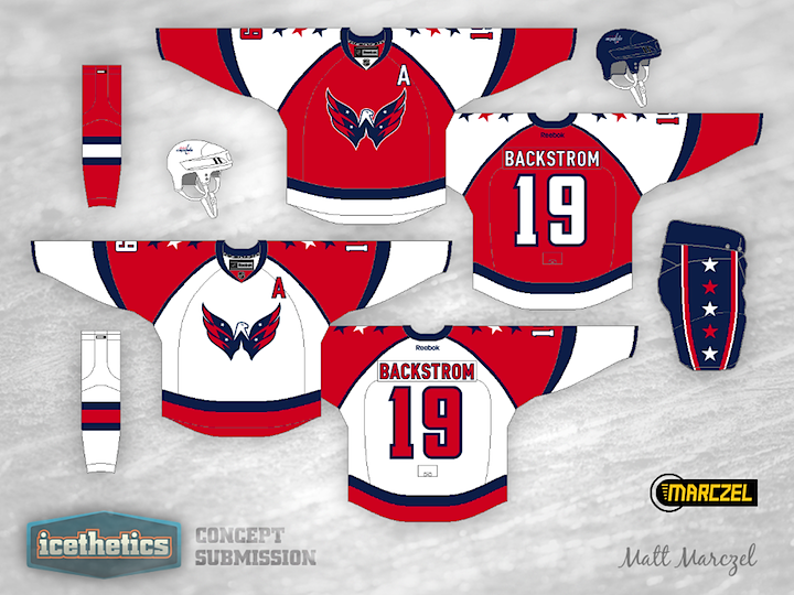
Another double feature on this Tuesday! Stars Week wouldn't be complete without a stop in America's capital city. In his Washington Capitals concept, Matt Marczel hasn't just added stars to the jerseys, he's added them to the logo as well. Look at these and tell me that "Weagle" logo doesn't belong on the front of a uniform. Granted, the stars may be a bit much.
We have another prolific artist in Colin May who thinks the Caps jerseys need more stars. I find myself oddly enjoying the shoulder yoke on this one. You wouldn't think I'd like it that much in this context, but somehow it works. Got a favorite between these two?
Stars Week continues with a double feature. What if the New York Americans were still around? What might they look like today? These guys have a few ideas. Brian Bridea put together the first one. Very clean and simple. I could see it in use today. Of course something would have to be done to get the name on the back.
Meanwhile, Scott Saffran's design feels much less modern and more of a throwback. Maybe it's all that "vintage white" we love so much. It's still a neat look. Which of the two do you prefer?