Sunday
Jul012012

0134: Go Team Finland!

For the last few Sundays, I've been featuring concepts with more of an international flavor. So I thought I'd keep it up with the Olympics around the corner. Today, Jekabs Elerts presents a very sharp look for Finland. But it feels incomplete. Where's the Suomi?

By the way, if I had planned ahead better, I would've held last week's Team Canada concept for today to celebrate Canada's Independence Day. Oops. But you can bet on red, white and blue for the Fourth of July.

Saturday
Jun302012

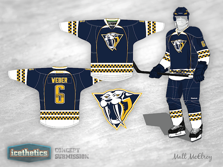
0133: Saber-Toothed Predators

We're probably not getting any new third jersey this fall, but that's not going to stop our concept artists from proving why we should be. Matt McElroy has a blue option for the Nashville Predators and it's a pretty solid look, if you ask me. Now I'm asking you. Thoughts?

Friday
Jun292012

0132: The Philangeles FlyKings

Inspired by Ross Taylor's series of brand-blended concepts, Ty Hill set out to merge a couple of 1967 expansion clubs. Is this what would happen if the Philadelphia Flyers and Stanley Cup champion Los Angeles Kings mated? I don't know but it's definitely a Freak Out Friday.

Thursday
Jun282012

0131: Beantown Bees

Bees. First thing I thought of when I saw this Bruins jersey by Brian Brideau. But as I keep looking at it, I can't help but like it. I realized that it's unlike any other jersey in the NHL because of one thing. There isn't a speck of white on it. Every other NHL jersey either has white or some variation (silver or something cream-like). It's true. Now, there's nothing wrong with white, I just think it might be something to see a jersey without it.

Wednesday
Jun272012

0130: The Minimalist Hurricanes

I've always thought the Carolina Hurricanes could use a more simplified jersey design. Ryan Haslett shows us here what that might look like. Clean and minimalist. Works for me. (By the way, can you believe this is the first Hurricanes concept since I revamped the Concepts page?)

Tuesday
Jun262012

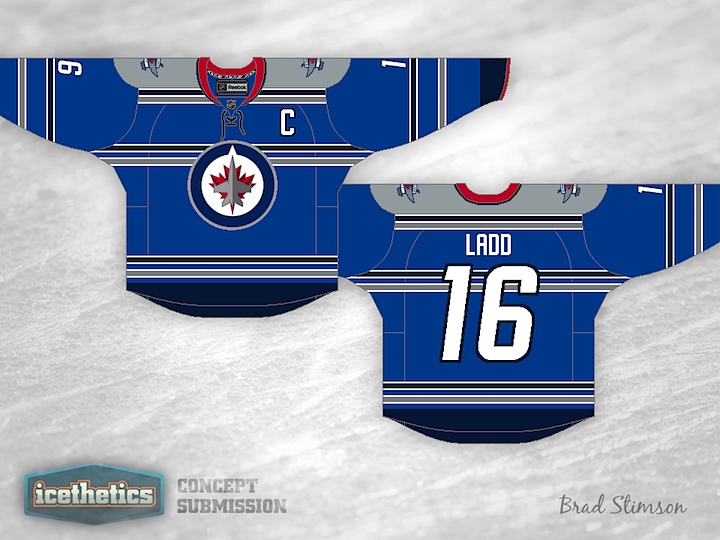
0129: Inspired by the RCAF Flyers

The Winnipeg Jets probably won't be introducing a third jersey in 2012, but it can't be too many years off when there's big money to be made. So Brad Stimson came up with a design concept he'd like to see put into use. Here's what he says about it:

Like others online, I took inspiration from the RCAF Flyers jersey from 1948, no NHL team uses anything quite like it.. So I would love to see something like this worn by the Jets 2.0.

True North is obviously not using too much red, but I felt it should be included in some way, so I kept the amount of red to a minimum. All colours are from their current scheme and I like the Jets number and letter font, so I stuck with it. I think a jersey like this would be a realistic option for them, and I would love to see if Icethetics readers agree with me at all.

So... do you?

Monday
Jun252012

0128: Canucks and Stripes

Every once in a while we get one of those off-the-wall concept jerseys. This is definitely not the sort of thing we normally see. Steven Grant's green Canucks sweater is a novel idea even if it isn't perfect. I like the two-tone green stripes but I feel like the logo and numbers on the chest get a little lost in the shuffle. Curious to know what you guys think of this style.