


Monday
Feb272012
Quebec Nordiques
 8 Comments
National Hockey League: 1979—1995
Became Colorado Avalanche (1995—)
 Crest, helmet, pants
 Shoulders
| 1991—1995
Road uniform
 7 Curtis Leschyshyn
 9 Mike Ricci
 11 Owen Nolan
 19 Joe Sakic
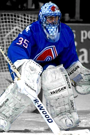 35 Stephane Fiset
 52 Adam Foote
 |
 Crest
 Shoulders
Pants
| 1991—1995
Home uniform
 4 Uwe Krupp
 13 Valeri Kamensky
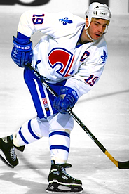 19 Joe Sakic
 21 Peter Forsberg
 25 Martin Rucinsky
 41 Jocelyn Thibault
 |
Other galleries to be added for this team:
- 1979—1991: Home/road uniforms


Reader Comments (8)
What a beautiful jersey! If the Nords ever come back in the NHL, the new team's jersey should be inspired by this one. So much love and history in this logo.
Seattle and Quebec City should have expansion teams. Both cities deserves a team.
Love the logo on Uwe Krupp's gloves... CCM needs to start doing this again.
Legit!
I have always loved this jersey set. I always hear that it's either an "n" or an igloo. Which is it? I've always figured it looked way more like an igloo than an "n". Is the gap at the bottom of the arch the door to the igloo, with a stick cutting off the rest of the image? Just curious.
Some of the best jerseys ever in the NHL. I hope Quebec gets a team back and they go back to these jerseys.
Not to nit-pick, but it looks like Sakic's Blue jersey there is pre-1991, as the sleeve number doesn't appear to be outlined in red.
@Jumbojet33 : You're right about that, that jersey is pre-91. In addition to the numbers not outlined, the other difference is the crest on front of the jersey; it's much smaller...
I love both the white and the blue. When the Nordiques and the Whalers left they took two of the best jerseys in the NHL with them.
@ Dawson...apparently it is both. An 'N' and an igloo formed by the N and stick. The arch represents the door.