


Vancouver Canucks
 10 Comments
National Hockey League: 1970—
Quick links: Current alternate | Current home | Current road
 Crest, pants
 Shoulders
 Helmet right
 Helmet left
| 2008—
Alternate uniform

 1 Roberto Luongo
 5 Christian Ehrhoff
 14 Alexandre Burrows
 17 Ryan Kesler
 29 Aaron Rome
 35 Cory Schneider
Unveiled 11/13/2008, modeled by Roberto Luongo, Mattias Ohlund, Willie Mitchell and Ryan Kesler [blog post] ... Debuted 11/15/2008 vs. Toronto Maple Leafs (W 4-2) Photos: Getty Images/NHL.com |
 Crest
Shoulders, pants
 Helmet
| 2007—
Home uniform
 3 Kevin Bieksa
 15 Tanner Glass
 22 Daniel Sedin
 23 Alexander Edler
 33 Henrik Sedin
 35 Cory Schneider
Unveiled 8/29/2007 [blog post] ... Debuted 10/5/2007 vs. San Jose Sharks (L 1-3) Photos: Getty Images/NHL.com |
 Crest
 Shoulders
 Helmet
Pants
| 2007—
Road uniform
 1 Roberto Luongo
 2 Dan Hamhuis
 4 Keith Ballard
 14 Alexandre Burrows
 22 Daniel Sedin
 26 Mikael Samuelsson
Unveiled 8/29/2007 [blog post] ... Debuted 10/6/2007 at Calgary Flames (W-OT 4-3) Photos: Getty Images/NHL.com |
Specialty Uniforms
 Crest
 Chest right
| 2010-2011
40th Anniversary uniform / 1970-71
 1 Roberto Luongo
 2 Dan Hamhuis
 22 Daniel Sedin
 26 Mikael Samuelsson
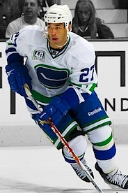 27 Manny Malhotra
 54 Aaron Volpatti
Unveiled 7/7/2010, modeled by Henrik Sedin and Orland Kurtenbach [blog post] ... Debuted 10/9/2010 vs. Los Angeles Kings (L-SO 1-2) ... Worn four additional times: 10/26/2010 vs. Colorado Avalanche (W-OT 4-3); 11/6/2010 vs. Detroit Red Wings (W 6-4); 12/18/2010 vs. Toronto Maple Leafs (W 4-1); 2/22/2011 vs. Montreal Canadiens (L 2-3) ... Replica of uniform worn by Canucks 1970—1972, staying true to original design by not using modern nameplates ... Retired 2/22/2011, as only indicated for use during Canucks' 40th anniversary season (2010-11) Photos: Getty Images/NHL.com |
Other galleries to be added for this team:
- 2006-2007: Alternate uniform
- 2001—2006: Alternate uniform
- 1997—2007: Home/road uniforms
- 1995—1997: Alternate uniform
- 1989—1997: Home/road uniforms
Photo research assisted by Jenn W.


Reader Comments (10)
Did anyone else notice the difference between the white alternate and the rest of the uniforms socks? I just noticed that in the white alternate (stick in rink) that there is only a big blue stripe followed by small white and then a big green one. In all the other uniforms, there its small blue, white, green, small blue. Just a nuance.
yeah because theyre throwbacks and they modernized their look for their new units so they dont have the same design....just like there's more spacing between the white and green on their altenate blue's than their home socks...very small difference and hard to notice but it's there
Has anyone noticed how the piping on the home/away uniforms is not consistent between the socks and the sleeves of the jersey? The piping is thicker on the socks than it is on the sleeves.... yet another reason why the whale jerseys need to go.
Anthony, if you look closely at the Sedin and Samuelsson pics, the green and blue sock stripes are essentially the same size, with the thin white stripe being about the same size as on the jerseys. With the other pics where the green and blue appear different sizes, the socks are either bunched up, or the player's using white tape.
By the way, the anniversary jersey has the best collar of all of them. The blue-white-green just looks so much better than the thin blue-wide white.
All vancouvers gotta do is make the 40th ann. jersey an away, create a home version for it and add names to the back. Then make the black '94 one an alternate sweater
vancouver should make the 40th ann jerseys as their aways, add the blue 1970-71 as a home jersey and get the 94 jersey as an alternate
... and add names to the home and away of course
A Canuck is not a stick in a rink, a flying skate, or a whale. I think the canucks should stop brainwashing young kids and use Johnny Canuck as the main logo. It's not hard to figure out.
These are some of the finest jerseys in the league!
Quite possibly the best color combination in the league. I think the Whale logo is the best, the stick in the rink is too simple in my opinion, and for people who always complain about Luongo I don't know why everyone wants to have him as the logo (Johnny Canuck).
Really? people prefer a head on top of a V instead of a fairly nice looking whale? If they took the Vancouver off the jersey it would be perfect.
So according to the polls people prefer the Columbus Blue Jackets uni's over Vancouver's? Something is WAY off on that. I'm not a Vancouver fan but love their jersey's, without a doubt in my top 5.