


Pittsburgh Penguins
 16 Comments
National Hockey League: 1967—
Quick links: Current alternate | Current home | Current road
 Crest, helmet
| 2011—
Alternate uniform
 7 Paul Martin
 26 Steve Sullivan
 44 Brooks Orpik
 48 Tyler Kennedy
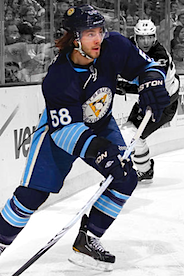 58 Kris Letang
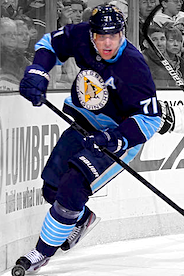 71 Evgeni Malkin
Announced 9/13/2011 [blog post] ... Debuted 10/15/2011 vs. Buffalo Sabres (L 2-3) ... Identical to uniform worn at 2011 Winter Classic Added 2/26/2012 | Photos: Getty Images/NHL.com |
 Crest
 Shoulder right:
2010-2011  Helmet
| 2008—2011
Alternate uniform

 9 Pascal Dupuis
 17 Michael Rupp
 18 James Neal
 25 Maxime Talbot
 29 Marc-Andre Fleury
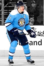 71 Evgeni Malkin
Unveiled 11/5/2008, modeled by Tyler Kennedy, Kris Letang, Alex Goligoski, Paul Bissonnette and Eric Godard [blog post] ... Debuted 11/15/2008 vs. Buffalo Sabres (W 5-2) ... Adapted from uniform worn at 2008 Winter Classic ... Retired 3/27/2011 vs. Florida Panthers (W-SO 2-1) Added 4/1/2011 | Photos: Getty Images/NHL.com |
 Crest, helmet left, pants
 Helmet right
 Shoulder right:
2007-2008  Shoulder right:
2010-2011 | 2007—
Home uniform
 1 Brent Johnson
 5 Deryk Engelland
 14 Chris Kunitz
 17 Michael Rupp
 58 Kris Letang
 87 Sidney Crosby
Unveiled 9/5/2007, modeled by Ryan Whitney [blog post] ... Debuted 10/6/2007 vs. Anaheim Ducks (W 5-4) Added 4/1/2011 | Photos: Getty Images/NHL.com |
 Crest, helmet left
 Helmet right
 Shoulder right:
2007-2008 Shoulder right:
2010-2011 Pants
| 2007—
Road uniform
 1 Brent Johnson
 2 Matt Niskanen
 9 Pascal Dupuis
 71 Evgeni Malkin
 72 Alex Kovalev
 87 Sidney Crosby
Unveiled 9/5/2007, modeled by Maxime Talbot [blog post] ... Debuted 10/5/2007 at Carolina Hurricanes (L 1-4) Added 4/1/2011 | Photos: Getty Images/NHL.com |
Specialty Uniforms
|
Crest, helmet
 Chest right
| 2011
NHL Winter Classic Uniform
 11 Jordan Staal
 18 James Neal
 25 Maxime Talbot
 29 Marc-Andre Fleury
 72 Alex Kovalev
 87 Sidney Crosby
Unveiled 10/28/2010 [blog post] ... Debuted 1/1/2011 vs. Washington Capitals (L 1-3) ... Also worn two other times without the chest patch: 2/10/2011 vs. Los Angeles Kings (W-OT 2-1); 3/12/2011 vs. Montreal Canadiens (L 0-3) Added 4/1/2011 | Photos: Getty Images/NHL.com |
|
Crest
Helmet
 Chest right
| 2008
NHL Winter Classic Uniform
 12 Ryan Malone
 20 Colby Armstrong
 35 Ty Conklin
 37 Jarkko Ruutu
 58 Kris Letang
 87 Sidney Crosby
Unveiled 11/4/2007 [blog post] ... Debuted 1/1/2008 vs. Buffalo Sabres (W-SO 2-1) Added 5/7/2011 | Photos: Getty Images/NHL.com |
Other galleries to be added for this team:
- 2002—2007: Home/road uniforms
- 2000—2002: Alternate uniform
- 1997—2002: Home/road uniforms
- 1995—1997: Alternate uniform
- 1992—1997: Home/road uniforms
- 1988—1992: Home/road uniforms
Photo research assisted by Jenn W.

Reader Comments (16)
What is up with James Neal's pants in the winter classic uniforms? They don't match anyone elses... They are a re-coloured version of the primary uniform pants.
Jimbo, I posted pictures of that recently. My guess would be that if the Penguins do make the 2011 Winter Classic uniform their new alternate next season, perhaps they'll use redesigned pants to match their home and road uniforms.
No, God, no. Not those pants, those don't go with the look at ALL. I kinda like the look, as long as they wear the right pants
what is the significance of the 250 patch?
It's a reference to the 250th anniversary of the city of Pittsburgh, which was founded in 1758.
That watered-down gold looks terrible.
I assume I'm one of the few people who prefer Vegas gold.
I liked the Vegas gold on the 2000-07 unis - mainly because the gold stripes are of nice, shiny gold material (hence actually looking metallic). The Edge versions look much more flat, more of a matte Vegas gold, thus looking much duller by comparison. Seriously, Reebok, you couldn't come up with shinier material for the fabrics in those panels?
I'm about equally disappointed with the template itself, specifically how Pittsburgh, Ottawa, and Tampa Bay pretty much stuck to it with very little creativity. At least none of those teams went with a contrasting color on that vertical piping that runs down the sides and wraps around to the back (Pittsburgh sticking with their uniform body color on that piping actually creates a decent separation effect between the gold underarm panels and the contrasting rear-bottom-side panels).
One interesting thing about the powder-blues is that they've used a two-tone version of their modern number font - introduced on the 1996 alternate, and based on the sleeve numbers used on the 1988 and 1992 uniform designs - instead of the chunkier, old-style numbers from the late 60s. Oddly enough, though, I think the modern font works fine here.
And then there's the 2011 WC unis. I can only hope they think better of the thought of adopting these as new thirds; at the very least, if they must, they really ought to scrap the "vintage cream" and go with true white - instead of looking dingy, the added contrast of actual white would make those uniforms pop.
Pittsburgh is my favorite team but i HATE the home and away jerseys. They should make the powder blues their home jerseys and a white version for away jerseys. As far as alternates go it should be the navy Winter Classic jersey. No black and vegas gold, go back to double blue!
vegas gold sucks. go back to black and yellow like the Steelers and Pirates. that's why they changed colors in the first place.
To me I love Pittsburgh and always have I really dug the Black, white and yellow gold of the 80's all 3 versions(home away and alternate). But the only time I liked "Vegas" gold on them was the jersey from just before the RBK Edge crap came in they were a very very classy jersey that I guarantee would have become one of the NHL's best jersey sets before they went with the color by number Edge crap-a-form uniform system. I really with they would go back to that. I liked the powder blue as an alternate but the best uni combos for Pitt could be the Black and whites I referenced from just before the Edge and if they want a blue jersey the Rimouski jersey from when he was there(re-logoed and colored to fit) would be cool
I agree with Matt. Loved the black and yellow. The Vegas sucks.
If they replaced the faded gold in their jerseys with classic bright yellow, the Pens' sweaters would be fantastic. And I love the over-stripedness of the 2011 Winter Classic/new thirds.
The Vegas gold looks too watered-down. The Pens need to return to the colors--with the skating penguin, of course--they wore during their first two championships.
I hate the Pens third jersey. Absolute garbage especially when you already had a great third with the powder blue.
It's a shame such a good team wears such crappy uniforms. Their colors are black, white and PUKE. Anyone calling that gold needs their balls cut in half. And the Edge cut needs to be done away with and replaced with a more traditional design.