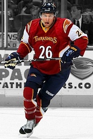
Atlanta Thrashers
 Wednesday · Mar 16 · 2011 | 5:33 PM PDT
  12 Comments
 National Hockey League: 1999—2011
Became Winnipeg Jets (2011—)
 Crest
 Shoulder right
 Shoulder left
 Helmet right
 Helmet left
 Pants
|
 6 Ron Hainsey
 10 Bryan Little
 16 Andrew Ladd
 26 Blake Wheeler
 27 Chris Thorburn
 31 Ondrej Pavelec
Unveiled 10/8/2008, modeled by Niclas Havelid, Colby Armstrong, Ilya Kovalchuk, Slava Kozlov and Mathieu Schneider [blog post] ... Debuted 11/14/2008 vs. Carolina Hurricanes (W 3-2) ... Retired 4/8/2011 vs. Carolina Hurricanes (L 1-6) ... Retirement announced 4/14/2011 [blog post] ... Relocation of team to Winnipeg announced 5/31/2011 Photos: Getty Images/NHL.com |
 Crest
 Shoulder right
 Helmet right
 Helmet left
 Pants
|
 9 Evander Kane
 10 Bryan Little
 16 Andrew Ladd
 20 Radek Dvorak
 50 Chris Mason
 80 Nik Antropov
Unveiled 9/14/2007, modeled by Alexei Zhitnik [blog post] ... Debuted 10/5/2007 vs. Washington Capitals (L 1-3) ... Relocation of team to Winnipeg announced 5/31/2011 Photos: Getty Images/NHL.com |
 Crest
 Shoulders
 Helmet right
 Helmet left
 Pants
|
 4 Zach Bogosian
 8 Alexander Burmistrov
 31 Ondrej Pavelec
 33 Dustin Byfuglien
 39 Tobias Enstrom
 80 Nik Antropov
Unveiled 9/14/2007, modeled by Pascal Dupuis [blog post] ... Debuted 10/5/2007 at Tampa Bay Lightning (L 2-5) ... Relocation of team to Winnipeg announced 5/31/2011 Photos: Getty Images/NHL.com |
Other galleries to be added for this team:
- 2003—2007: Alternate uniform
- 1999—2007: Home/road uniforms
Photo research assisted by Jenn W.


Reader Comments (12)
I live about fifteen minutes from their AHL affiliate, so I see their jerseys every once in a while and when I go to Wolves games... and I just can't help but feel disappointed at their jersey set. I love their logo and think they have a lot of potential around it, but they just don't have a good look to me. Need to be more focused on dark blue and orange as their colors.
seriously, i dont like how they have s many colors/logos and stuff going on with the jerseys. the atlanta down the left arm WAS a sweet design, but with the slight shift to old school unis in the nhl. atlanta needs a classic rebrand. just re do the jerseys and logos and colors and think this could be a great looking franchise, tho it wont be there very long haha
Great job as always, but man, I never I noticed how bad this team needs a redo in their uniforms until I saw all their pics together. Simplification, unification, anything else!
every one is awful. they look like soneone hurled on them
The sad thing about the Thrashers, is that they have a really nice shade of red for their alternate jersey, and a decent shade of pale blue for their homes. Why they then made such a horrifying alternate jersey is beyond me. The homes would be nice, if they only had some sort of definition (a stripe or something) at the bottom.
They just can't seem to decide on what concept they want to go with.
Every one of these jerseys are crap, they seriously need to go back to the drawing board. I agree with taoiseach, they have a great colour scheme to use but just cannot seem to use it properly.
I don't understand why their alternate gets so much disrespect. It's unique, exciting, and bold, yet not too flashy or annoying. The shoulder patches are very original, and it pulls off the college style letters/numbers on the front well. I own one of these jerseys and if they made uncrested ones, I'd buy one and wear it proudly whenever I play. I really hate to see it go.
I actually like their baby blue unis, mostly the pre-EDGE versions. I have a Kovalchuk one and it's one of my favorites in my collection.
Hmm well Atlanta is onward to Winnipeg, so we don't have to see those ugly Alternates anymore, but I do not mind their home or road jerseys.
I must be one of the few people who actually like the red alternate jerseys. I do think their original dark jerseys were better than the powder blue ones though.
I was wondering where the pre-RBK Edge sets are. All the other teams have extensive galleries, why not here?
Hardly any other teams have extensive galleries at this point. Sabres and Ducks, maybe, but they're the exceptions. I've been having trouble tracking down quality game photos from the pre-Reebok years. I'll get there eventually, but it's not a high priority at the moment.