


Buffalo Sabres
 12 Comments
National Hockey League: 1970—
Quick links: Current alternate | Current home | Current road
 Crest
 Helmet
| 2010—2012
Alternate uniform

 4 Steve Montador
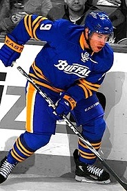 9 Derek Roy
 26 Thomas Vanek
 28 Paul Gaustad
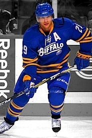 29 Jason Pominville
 30 Ryan Miller
Unveiled 9/18/2010 [blog post] ... Debuted 10/9/2010 vs. New York Rangers (L 3-6) ... Features elements inspired by AHL's Buffalo Bisons uniform, a team which played in Buffalo until the Sabres arrived in 1970 ... Launched for Sabres' 40th anniversary season ... Retired 3/14/2012 vs. Colorado Avalanche (L-SO 4-5) Added 3/6/2011 | Photos: Getty Images/NHL.com |
 Crest, helmet
 Pants
| 2010—
Road uniform
 3 Jordan Leopold
 9 Derek Roy
 20 Rob Niedermayer
 26 Thomas Vanek
 40 Patrick Lalime
 55 Jochen Hecht
Unveiled 9/18/2010 [blog post] ... Debuted 10/8/2010 at Ottawa Senators (W 2-1) Added 3/6/2011 | Photos: Getty Images/NHL.com |
|
Crest, helmet, pants
| 2008—
Home uniform (2010—)
Alternate uniform (2008—2010)
 19 Tim Connolly
 21 Drew Stafford
 28 Paul Gaustad
 30 Ryan Miller
 52 Craig Rivet
 57 Tyler Myers
Unveiled 9/20/2008 [blog post] ... Debuted 11/26/2008 vs. Boston Bruins (W 3-2) ... Retired as alternate uniform 4/6/2010 vs. New York Rangers (W 5-2) ... Debuted as home uniform 10/11/2010 vs. Chicago Blackhawks (L 3-4) Added 3/6/2011 | Photos: Getty Images/NHL.com |
 Crest, helmet right
 Helmet left
 Shoulders
 Pants
| 2007—2010
Home uniform
 9 Derek Roy
 17 Dominic Moore
 22 Adam Mair
 26 Thomas Vanek
 28 Paul Gaustad
 35 Jocelyn Thibault
No unveiling, first seen online 9/12/2007, modeled by Brian Campbell [blog post] ... Debuted 10/5/2007 vs. New York Islanders (L 4-6) ... Retired 3/31/2010 vs. Florida Panthers (W 6-2) Added 5/5/2011 | Photos: Getty Images/NHL.com |
 Crest
 Shoulders
 Helmet
Pants
| 2007—2010
Road uniform
 1 Jhonas Enroth
 9 Derek Roy
 22 Adam Mair
 38 Nathan Paetsch
 41 Clarke MacArthur
 52 Craig Rivet
Debuted 10/6/2007 at New York Islanders ... Retired 4/11/2010 at New Jersey Devils (L 1-2) Added 5/5/2011 | Photos: Getty Images/NHL.com |
 Crest, shoulders
Helmet right
Helmet left
Pants
| 2006-2007
Alternate uniform
 9 Derek Roy
 15 Dainius Zubrus
 23 Chris Drury
 29 Jason Pominville
 30 Ryan Miller
 48 Daniel Briere
Unveiled 9/16/2006 [blog post] ... Debuted 10/14/2006 vs. New York Rangers (W 7-4) ... Retired 4/5/2007 vs. Boston Bruins (W 4-2) Added 5/5/2011 | Photos: Getty Images/NHL.com |
|
Crest, helmet right
Helmet left
Shoulders
Pants
| 2006-2007
Home uniform
 15 Dainius Zubrus
 23 Chris Drury
 26 Thomas Vanek
 30 Ryan Miller
 55 Jochen Hecht
 61 Maxim Afinogenov
Unveiled 9/16/2006 [blog post] ... Debuted 10/6/2006 vs. Montreal Canadiens (W-SO 5-4) Added 5/5/2011 | Photos: Getty Images/NHL.com |
|
Crest
Shoulders
 Helmet
Pants
| 2006-2007
Road uniform
 10 Henrik Tallinder
 15 Dainius Zubrus
 35 Ty Conklin
 48 Daniel Briere
 51 Brian Campbell
 55 Jochen Hecht
Unveiled 9/16/2006 [blog post] ... Debuted 10/4/2006 at Carolina Hurricanes (L-SO 2-3) ... Retired 4/8/2007 at Philadelphia Flyers (L 3-4) Added 5/5/2011 | Photos: Getty Images/NHL.com |
Specialty Uniforms
 Crest, helmet
Shoulders, pants
 Chest right
| 2008
NHL Winter Classic Uniform
 10 Henrik Tallinder
 19 Tim Connolly
 20 Daniel Paille
 29 Jason Pominville
 30 Ryan Miller
 51 Brian Campbell
Unveiled 11/4/2007 [blog post] ... Debuted 1/1/2008 at Pittsburgh Penguins (L-SO 1-2) Added 5/5/2011 | Photos: Getty Images/NHL.com |
Other galleries to be added for this team:
- 2000—2006: Alternate uniform
- 1996—2006: Home/road uniforms
- 1983—1996: Home/road uniforms
Photo research assisted by Jenn W.


Reader Comments (12)
I know I'm biased, but I love all three current Sabres jerseys! I'm so glad they have gone back to the original style logo!
Three ways to improve the road whites (of course, this is just my opinion):
1. Increase the thickness of the yoke piping. If Edmonton can do it, why not Buffalo?
2. Increase the blue-to-silver ratio on the stripes - 2:1 favoring blue instead of an even 1:1. The blue doesn't stand out enough with the silver blending into the white.
3. Ditch the numbers on the front of the jersey. (Applies to the navy jersey as well.)
These minor things are just enough to keep me from giving the white jersey a 5; similarly, the piping and "pit-stains" keep me from giving the same score to the navy jersey. All-around, very nice jerseys, but I think they could be just ever so slightly better.
I agree 100% with Rob also they need to add the logo to the blue shoulders on the road jerseys and to the shoulders of the home as well, like the originals did.
I agree with Rob's suggestions, but have to add one that every die-hard Sabres fan should recognize: switch the striping on the waist. For 26 years, the white waist was gold-blue-gold, opposite of the arms, and it should be again. Not only would it be historically correct, but it would also do a lot to keep the striping from being lost on those jerseys, as the current silver/blue-gold-silver/blue blends in too much with the white.
I wouldn't mind them shifting the blue a shade or two closer to royal blue. Not enough that they would look completely different, but just enough that the home jerseys don't look black and orange on TV sometimes.
After years of fugly jerseys in Buffalo, they finally have it right. Some of the best jerseys in the NHL, just get rid of the numbers on the front.
I do prefer the original waist-stripe arrangement on the white jersey as well, which can be seen nicely on the newly-added Winter Classic jerseys (which also have the shoulder logos, although the shoulder piping is still pretty weak).
One thing's for sure... 'Slug aside, the uniform pattern looks far better on the Edge cut than on the classic cut. As for the Edge cut overall, I'd still like to see the return of the straight hemline. That shirt tail is just too much loose real estate, and it's just not a good look - even the couple of teams that have put stripes along the hem (Dallas, Columbus, Tampa Bay alt) are leaving a huge amount of space between those stripes and the numbers.
2006-2007 alternates are nice sweaters but they look horrible with the different color blue pants and helmets. Would it have blown the budget to get matching color accessories?
Loving the Winter Classic collection. That is still my favorite Sabres jersey to date. Too bad you can't ever buy one, as they never made them for retail sale (replica or authentic.) So, there's the just the game worns, a couple of game issued (players who were injured or scratched), and a few special ones for people like the owners (majority and minority.) One of the holy grails for collectors along with the "NEW YORK" white jerseys worn against the Rangers on 10/7/01.
Im a Buffalo native and I have their current home jersey. I think its perfect. the white ones however...look very good, except the striping. not enough blue. but the white ones still look great to me. just that improvement would make them better. and im absolutely in love with their 40th anniversary alternate. i really hope they keep them around. BEAUTIFUL
You all seem to forget the pit stains. Get rid of the god awful pit stains on the sweater! Please!
The Sabres' jerseys are my favorite in the NHL, and they're nearly perfect... if it weren't for those damn armpit stains.
I really can't comprehend what the advantage of those stupid gray armpit stains on the home & away are. It just makes the sweaters look gross.
The gray piping up the sides of the home & away is awful too, but it's nothing compared to those armpit stains.
I really like that Buffalo went back to their original logo. They, like St. Louis, should go back to the original shade of blue they used when they first joined the league. It would improve the uniforms 100%, and they are already good.