


Tuesday
Apr262011
Colorado Avalanche
 14 Comments
National Hockey League: 1995—
Previously: Quebec Nordiques (1979—1995)
Quick links: Current alternate | Current home | Current road
 Crest
 Shoulders
 Helmet
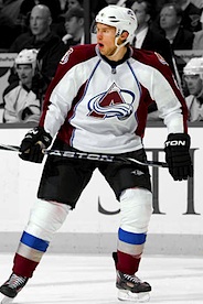
| 2009—
Alternate uniform

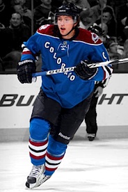 9 Matt Duchene
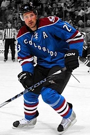 23 Milan Hejduk
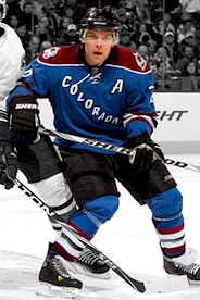 26 Paul Stastny
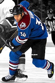 34 Daniel Winnik
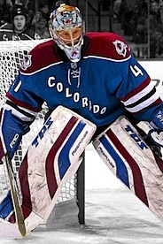 41 Craig Anderson
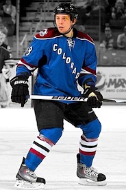 48 Matt Hunwick
Unveiled 11/12/2009, modeled by Kyle Quincey and Paul Stastny [blog post] ... Debuted 11/14/2009 vs. Vancouver Canucks (L 2-8) Photos: Getty Images/NHL.com |
|
Crest
 Shoulders
Helmet
| 2007—
Home uniform
 3 Ryan O'Byrne
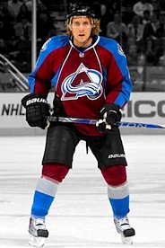 4 John-Michael Liles
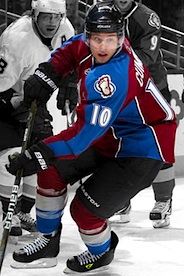 10 Kyle Cumiskey
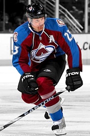 23 Milan Hejduk
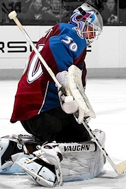 30 Brian Elliott
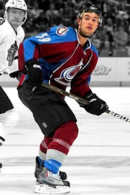 39 T.J. Galiardi
Unveiled 9/12/2007, modeled by John-Michael Liles [blog post] ... Debuted 10/3/2007 vs. Dallas Stars (W 4-3) Photos: Getty Images/NHL.com |
 Crest, helmet
 Shoulders
| 2007—
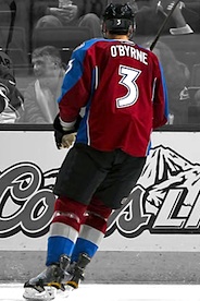
Road uniform
 6 Erik Johnson
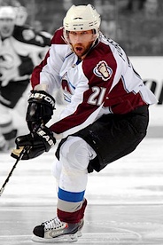 21 Peter Forsberg
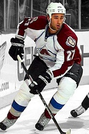 27 Kyle Quincey
 31 Peter Budaj
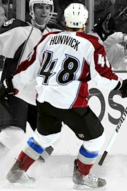 48 Matt Hunwick
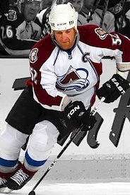 52 Adam Foote
Unveiled 9/12/2007 [blog post] ... Debuted 10/4/2007 at Nashville Predators (L 0-4) Photos: Getty Images/NHL.com |
Other galleries to be added for this team:
- 2001—2007: Alternate uniform
- 1995—2007: Home/road uniforms

Reader Comments (14)
I know they've always had them since they're creation...but damn those black pants and helmets just need to go! They just look so out of place to me as the uni's have next to zero black on them.
Maybe swap it for the maroon and then bring back some horizontal stripes on the jersey to break it up? I don't know, I just feel like this jersey definitely needs some help.
I never understood why Colorado wears black helmet, gloves, and mits. It just doesn't make sense. The Uniforms are half decent but they would look 10 times better with blue or red gear. They barley have any black on any part of their jerseys! it just does not make sense. I think no black all together would really improve this set. Just my opinion..
Right up there with the ugliest unis in the league, especially the white ones. Look like glorified pajamas, and maroon?? Gross
If the third jersey had a logo and hem stripes, it would be one of the best in the league.
One of he most cartoonish uniforms in the league today. From the stupid Bigfoot shoulder patches to the arrow shaped number 6 and captain's 'C'. They look like a pee wee team's uniform.
They have the black becuase they had to get everything in a hurry after the move, and there wasn't time to get the custom colors that either the blue or burgundy would require made up in pants, gloves and helmets. So they wore black, and it stuck.
If I remember the story correctly, they didn't even have white helmets for the first bit of that first season.
Another design that the Edge template utterly annihilated. The peaks and valleys striping design made the Avs unique and pretty decent-looking, but these home and road jerseys look like crap.
The alt - I agree that it'd be better with waist striping and an actual logo on the front.
These are so ugly! The colors are bad and the design is worse. They need to change EVERYTHING!
This team took a huge hit due to the edge jersey cut. I never minded their original uniform set. Between the steel blue and burgundy, I always thought they had nice colours that worked well together. If they were to go back to the old jersey design, and slightly tweak the numbers look so it wasn't so cartoonish, they would be a good set.
Aurthur Spooner Id like to see u do better, the reebok age has killed this teams uni, but to trash the 'c' that Joe Sakic has worn for years is too far
I'm a die hard Wings fan and I think the Colorado jerseys have always been some of the best in the league, until Reebok screwed them up. The jerseys were so much better when the sleves didn't have the straight lines. The piping on the front doesn't look good either. I really like both alternate jerseys the Av's have used over the years also. I also really like the numbering font the team uses. The Starter mesh jerseys they originally wore were some of the best ever in the NHL. I do agree with those above who suggest they dump the black pants, gloves, and helmets.
Not that bad of a jersey... The alternate jersey with the diagonal Colorado with the strings is a poor attempt to copy the NY Rangers... Only the Rangers should be allowed to rock the diagonal letters.
You people trashing these are crazy. Yes the originals were better, but these still aren't that bad. Seriously, pajamas? Peewee jerseys? Are you nuts? Both home and away are among the best in the NHL.
JL ,Uuuuhhhh............ dude, they're bad, I mean reallllyyy bad. I'm a huge Avs fan, but no way are they among the best in the league. They totally look like aprons and really bad ones at that.