


Monday
Nov212011
Ottawa Senators
 19 Comments
National Hockey League: 1992—
Quick links: Current alternate | Current home | Current road
 Crest
 Shoulder right
 Shoulder left
 Helmet, pants
 Chest right:
2011-2012 | 2011—
Alternate uniform
 11 Daniel Alfredsson
 14 Colin Greening
 16 Bobby Butler
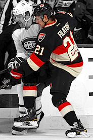 21 Nikita Filatov
 41 Craig Anderson
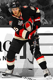 65 Erik Karlsson
Unveiled 10/1/2011 [blog post] ... Designed by fan Jacob Barrette ... Debuted 10/13/2011 vs. Colorado Avalanche (L 1-7) Added 11/21/2011 | Photos: Getty Images/NHL.com |
 Crest
 Shoulders, helmet, pants
| 2008—2011
Alternate uniform

 11 Daniel Alfredsson
 14 Chris Campoli
 19 Jason Spezza
 33 Pascal Leclaire
 55 Sergei Gonchar
 71 Nick Foligno
Unveiled 11/22/2008, modeled online by Chris Phillips, Daniel Alfredsson and Dany Heatley [blog post] ... Debuted 11/22/2008 vs. New York Rangers (W 4-1) ... Retired 3/17/2011 vs. New Jersey Devils (W 3-1) Added 2/14/2011 | Photos: Getty Images/NHL.com |
 Crest
 Shoulders
Helmet, pants
 Chest right:
2011-2012 | 2007—
Home uniform
 4 Chris Phillips
 17 Filip Kuba
 25 Chris Neil
 27 Alex Kovalev
 65 Erik Karlsson
 73 Jarkko Ruutu
Unveiled 8/22/2007, modeled by Chris Neil and Jason Spezza [blog post] ... Debuted 10/4/2007 vs. Toronto Maple Leafs (W 3-2) Added 2/14/2011 | Photos: Getty Images/NHL.com |
 Crest, helmet
 Shoulders
Pants
 Chest right:
2011-2012 | 2007—
Road uniform
 9 Milan Michalek
 11 Daniel Alfredsson
 12 Mike Fisher
 30 Brian Elliott
 55 Sergei Gonchar
 65 Erik Karlsson
Unveiled 8/22/2007, modeled by Brian McGrattan and Chris Kelly [blog post] ... Debuted 10/3/2007 at Toronto Maple Leafs (W-OT 4-3) Added 2/14/2011 | Photos: Getty Images/NHL.com |
Other galleries to be added for this team:
- 2000—2007: Alternate uniform
- 1997—2007: Alternate/home uniform
- 1995—1999: Road uniform
- 1992—1995: Road uniform
- 1992—2000: Home uniform


Reader Comments (19)
Sorry to say Ottawa fans, you have the worst set of jerseys in the NHL. The black third is especially the worst.
That's a bit harsh there, HockeyFan. I have to say that while I'm not a fan of the black "Sens", they are hardly the WORST. Compared to that awful garbage teams like the Panthers, the Sharks, Edmonton, and Dallas are wearing, these aren't half bad.
U R right! The only Senator jerseys that I ever liked were the ones that they debuted with back in ............? whatever year that was. They were classic retro type.
I wouldn't say they are the worst, but def bottom 10 in the league. Let Pittsburgh keep the cookie cutter template and let Ottawa return to their jerseys pre-2000. That white/black set rocked! Go Sens Go!
People have to realize that the "Age of Reebok" sucked any creativity out of uniform designs because of the strict pattern it adheres to. They are not the baggy, loose, free-form jerseys worn up to 2006-ish. They are cookie-cutter templates that were imposed on every team. Yes, some jerseys look better than others but this is what happens when limits are put on the imagination. Things get ugly. Don't blame the graphic/uniform-designers all the way. They are trying to do what they can with what they are given.
Ottawa really needs to either go back to their older jerseys, or just make something new already!
Agreed Joe G., it is definitly the switch over to Reebok Edge that ruined a lot of the uniforms in the league. Time to go back to CCM or Nike.
I am curious to know what people would think about the black "SENS" jersey if it had a real logo on the chest and not the stupid word mark... I don't think the actual jersey itself is all that bad, but the "SENS" across the chest is just unacceptable for me.
^ It would definitely be an improvement having an actual logo rather than a wordmark. But as a jersey template, it needs to be more simplistic. I love the horizontal arm stripes but hate how they don't go all the way around and are cut off by the horrid red flashes of the underarms. Ottawa has a history of horizontal stripes and I think we should honor that in a clean, yet sharp way. The forthcoming =O= jersey may be just the remedy we need!
Ottawa definitely needs to go with the simple =O= logo for their third jersey. No ugly barberpole stripes all the way up the arms, just a couple of stripes around the elbows. Jacob Barrette's concept design is perfect. I'm praying that they choose his design or something very close to it so that I can buy one. I was so excited when they were about to introduce their black third jerseys, but when I saw those atrocities with "SENS" across the chest I couldn't bring myself to shell out the money. I'm a die-hard Sens fan, which isn't easy seeing as how I live in the GTA & the heart of Leafs territory, but even I think that those SENS jerseys are about the ugliest ones in the league. Even worse than the old, baby-vomit yellow ones Nashville used to wear. BRING BACK THE =O=!!!!
Check out Erik Karlsson's striping patterning on his pants. The white is closer to the front than the red. Everyone else's have the red closer to the front. Just curious as to what is going on there.
Blake ... Maybe his pants are on backwards?
The New Sens Heritage Jersey is EPIC, love the oldschool feel.
The heritage jersey is the first good jersey this team has had in nearly a decade. Ever since they jettisoned the original design/logo for that terrible, stripy, turning head idiot logo the Sens have consistently been the ugliest team in the NHL.
love the O!
Karlsson has different pants than his teammates in every picture. In both the home and away photos the striping is opposite his teammates'. And in the alternate jersey they're Bauer not Reebok. Weird.
Like most teams, I think the Sens had better sweaters in the pre-edge days. The three jerseys they had before they switched were oh so much better, mostly their red and black ones. Their current ones get major "meh" points for copying the Pens' design, and lacking major creativity. The first Edge unis for Tampa Bay had the same design, too. I dislike the Edge uniform system because the jerseys in general have gotten massively worse.
Their "Sens" alternate is alright, I'm not too much of a big fan of the throwbacks. Nice tributes, though.
Time to lose the Kiddy 3d crest, and go back to the Original 2D Crest or the nice Heritage "O" Jersey.
Black in Black baby!
At first I hated the black alternates they used from '08 - '11, but now they're starting to grow on me. I still however wish they would've used the regular logo instead of the "SENS" wording and not used the lacing, I think that would've made them look a lot better. I have the road jersey, so that should say what I think of that one and I like the retro alternates as well.