Saturday
Jan042014

0687: D.C. in Winter

The Washington Capitals will host the next NHL Winter Classic in 2015. But what should they wear when they do? Brian Brideau imagines a uniform inspired by the flag of the District of Columbia.

Friday
Jan032014

0686: Freak Out '80s Style

Tampa/Vancouver Week wraps up with a Vancity freak out. Bryan Dyck is merging the Canucks' 1980s color palette with their new Johnny Canuck logo. It's pretty clever but I'm not sure I'd want to see it anywhere outside the Concepts page. (Note the yellow socks!)

See a pattern forming here? Todd Varga added the 1980s palette to the stick-in-rink logo. Again, makes for a neat jersey set, but probably not one we'd want to see on the ice anytime soon.

Newcomer Dallas Kirkpatrick is just scaring me now.

And finally, I was saving this one. Remember yesterday's Johnny Canuck set from John Elbertson? He included this yellow one as well but it fit so much better with today's theme.

Thursday
Jan022014

0685: Johnny Canuck

As Tampa/Vancouver Week winds down, we continue to explore the Canucks' ongoing identity crisis. On Tuesday, the stick-in-the-rink logo was featured. Today, the star is Johnny Canuck. John Elbertson created this set with a home, road and retro-inspired alternate jersey.


Now how about in green?

Ben Macdonald's contribution would actually fit in quite nicely with John's home and road set. And that Johnny Canuck logo really stands out well on green.

Devin Durocher also went with green but I thought his overall feel was different enough from Ben's to warrant posting them together. Do you have a preference? Would you like to see Johnny Canuck on the chest of a Vancouver player someday?

By the way, is there a reason why everyone who designed a Johnny Canuck jersey put a goalie's name and number on the back? Weird, right?

Wednesday
Jan012014

0684: New Year, New Bolts

Happy New Year! Hey, believe it or not there's more than one NHL game on the schedule today. The Lightning are in Vancouver today — and so am I. And that's the reason for Tampa/Vancouver Week. Brandon Holmes gets 2014 started with a sharp two-tone blue set for the Bolts.

And as a bonus, here's a rare one. A completely original uniform and logo design from Devin Durocher. I like his simplified logo. Not sure about the third jersey. Thoughts?

We'll go back to the Canucks to finish out the week!

Tuesday
Dec312013

0683: The Stick in the Rink

We're riding out 2013 with the Canucks today as part of Tampa/Vancouver Week. The Lightning are in Vancouver tomorrow — one of only two games taking place in the NHL. (Any guesses what the other one is?) The theme today, as you may have guessed, is the Canuck's retro stick-in-the-rink logo. It's featured on every design today, including this one from Bastian Schmülling. I particularly like the green option.

Tex Fischer brings us a more subdued set. But I think that crest can make any sweater stand out.

Finally, Brendan Anderson envisions a minor tweak to the Canucks' existing third before making a home and road set out of it. All three designs have unique aspects and prove that this could be a great, timeless look for Vancouver.

Monday
Dec302013

0682: Bolts Flashback

As a Lightning fan living in Seattle, I don't get to many of my team's games these days. But since the NHL's realignment and new method of scheduling, my Bolts are guaranteed to visit nearby Vancouver once a year. That happens this week — on Wednesday, in fact. So in honor of that, I'm designating this Tampa/Vancouver Week on the Concepts page!

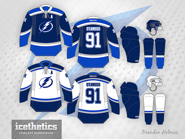
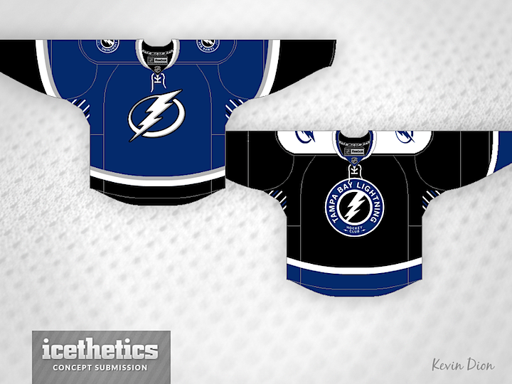
Today, we focus on the Lightning. First up is a throwback-inspired home and third jersey set by Kevin Dion. I'm not sure the shading is necessary on the primary logo, but otherwise it's a solid pair.

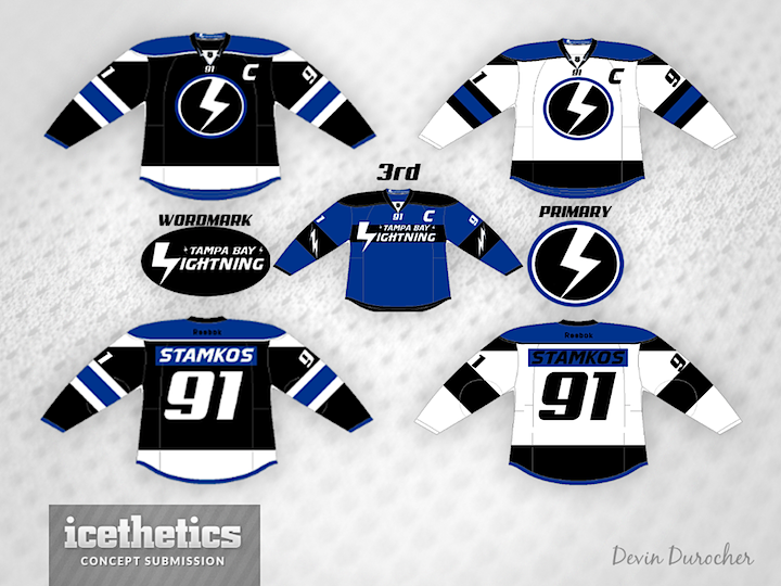
I also wanted to feature this one by Jonathan Tweedle. It'd be an interesting striping pattern for the Lightning to try. But with the '90s long behind us, I'm not sure we'll ever get the chance to see it happen. But both of these submissions beg the question: Do the Lightning need a black jersey again?

Tomorrow is all about the Canucks!

Sunday
Dec292013

0681: Slovenia in Sochi

For the last of Olympic concept of 2013, Eric Westhaver gives us his take on Slovenia's national team. It's a very creative design. Here's how he came up with it:

Slovenia's national soccer and basketball teams both use green and blue instead of red and blue. Why shouldn't the hockey team do the same? It's distinctive and, if the colors weren't enough, the arm and front stripes — based on the mountains in the country's coat of arms — certainly are.

Page 1 ... 3 4 5 6 7 ... 103 Next 7 Concepts »