Saturday
Jan112014

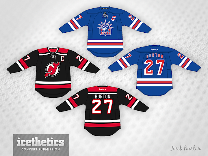
0694: NYC Stadium Showdown

With the Winter Classic behind us, the NHL Stadium Series is just around the corner. Check out these Rangers and Devils jerseys from Nick Burton. Would they make for a better looking outdoor game than the real jerseys?

Friday
Jan102014

0693: Winnipeg/Atlanta Freak Out

We've seen previous attempts at merging the old Atlanta Thrashers identity with that of the new Winnipeg Jets. But never quite like this. Brad Stimson presents this one for your enjoyment. Are you freaked out?

Thursday
Jan092014

0692: Post-Edge Bolts

Steven Grant has been on a mission to rescue the NHL from the grips of the infamous Reebok Edge jerseys. And he's been rather successful, as evidenced by this Tampa Bay Lightning set. He thinks the Bolts should revert back to their original Edge-era logos, however. As far as I'm concerned, give me victory stripes and a white shoulder yoke on the home jersey, and we've got a winner.

Wednesday
Jan082014

0691: The Flames by Hand

My favorite old school concept artist takes a stab at the Calgary Flames today. Morgo Uxbridge drew up this simplified uniform set. The third jersey was an interesting choice. Think it could work?

Tuesday
Jan072014

0690: Pittsburgh Preview

The rumors have been floating around that a new third jersey is on the way in Pittsburgh. Could this retro-inspired set by Scott Dempsey be a preview of what's to come?

Monday
Jan062014

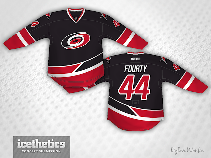
0689: Carolina Alternate

Sometimes you see a concept an have an instant reaction, good or bad. Normally I have to look at something a while before I can form an opinion. But this one from Dylan Wonka hit me immediately. I love this as a third jersey for the Hurricanes. It's one of the most unique striping patterns I've ever posted on these pages. What's your take?

Sunday
Jan052014

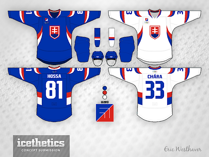
0688: Slovakia & Austria in Sochi

On this International Sunday we're treated to a two-fer from Eric Westhaver. First, take a look at his redesigned uniforms for Slovakia. Not much can compare to having the words of your national anthem built into the striping pattern, but this is a pretty sharp look too. Eric's comments follow.

No real significance for the Slovaks. I just figured with their bright colors that these kind of large, sweeping stripes would look pretty damn good.
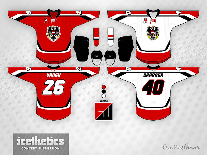
Eric also brings us his look for Austria. Another solid one. He writes:

Since the Austrians haven't been in the big tourney for 12 years, I figured some new ideas like the angular stripes and italicized font could work.

Check back next Sunday as Finland gets the Westhaver treatment.

Page 1 ... 2 3 4 5 6 ... 103 Next 7 Concepts »