Saturday
Nov302013

0652: Heritage Reimagined

We now know what the Canucks and Senators will wear when the hit the ice at B.C. Place in March, but how about a "what if?" Bastian Schmülling imagines the game looking something like this. Hard to say which I like better. This or reality? What's your take?

Friday
Nov292013

0651: Devil of a Freak Out

Freak Out Friday isn't about bad design — just stuff that's a little out there. I think it'll be a long time before we see a permanent third jersey for the New Jersey Devils. But when we do, Dan Capostagno imagines it without a shred of white. Always a fascinating choice to me.

Thursday
Nov282013

0650: Senator Stripes

In honor of the official unveiling of their Heritage Classic sweater, the Ottawa Senators are the subject of today's concept post. Nevill Carney likes the Sens' black third jersey from 2011 so he designed red and white ones to go with it.

Wednesday
Nov272013

0649: Back to Black and Red

The Buffalo Sabres recently debuted their controversial new two-tone third jersey. That got Arron Anastasia thinking of a previous era for the club. Anyone interested in seeing the the Sabres return to a color palette like this?

Tuesday
Nov262013

0648: The Red Blue Jackets

Given the team's name, it may seem like a non-starter, but imagine the Columbus Blue Jackets with red as their primary color. That's what Matt Madore presents today. It's a great looking set of jerseys even if it doesn't belong in Ohio's capital.

Monday
Nov252013

0647: Oiler Alternates

If we can all agree that the Edmonton Oilers now have their ideal home and road sweaters, what's left is a good third. Mat Ware takes a stab at a couple of options here. Which do you prefer?

Sunday
Nov242013

0646: The U.S. in Sochi

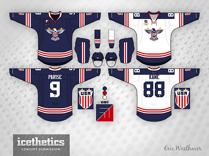
With the Olympics now more than three months away, I'm bringing back International Sundays. Each week we'll take a look at some interesting national team concepts. We're kicking things off with Eric Westhaver — a designer who's work you'll be seeing a lot here — and his take on Team USA. Below is his explanation of the design choices.

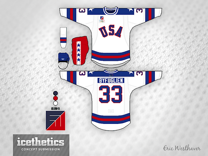
Patriotism reigns supreme here. There is a new eagle logo on the front, a new crest logo on the arms (shown on the side) and a brand new, totally original font with subtle stars and serifs. Eagle and crest both have two gold stars because of the two Olympic gold medals. The throwback is, of course, the Miracle on Ice. Because why not? U.S. hockey has never had a bigger moment after all!

Eric submitted a series of concepts for most of the countries taking part in this winter's Olympic tournament. They will be featured each Sunday.