Saturday
Sep282013

0589: Heritage Classic by Mat Ware

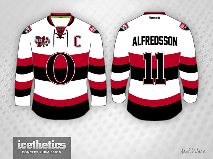
We're stretching this week's theme into another Classic Saturday thanks to Mat Ware. He's created Heritage Classic jerseys for all seven Canadian teams, but I thought I'd share three of them today. First is what we're likely to see Ottawa wear to this year's Heritage Classic in Vancouver — only without Daniel Alfredsson.

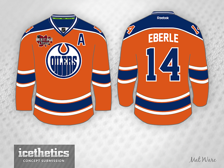
Here's an Oilers jersey I know a lot of people would like to see a couple of times a year. Did you know Edmonton actually wore orange for a couple of seasons during their WHA days? It makes for a nice looking sweater. And in an NHL will more than its share of gold jerseys, this is certainly not out of the realm of possibility.

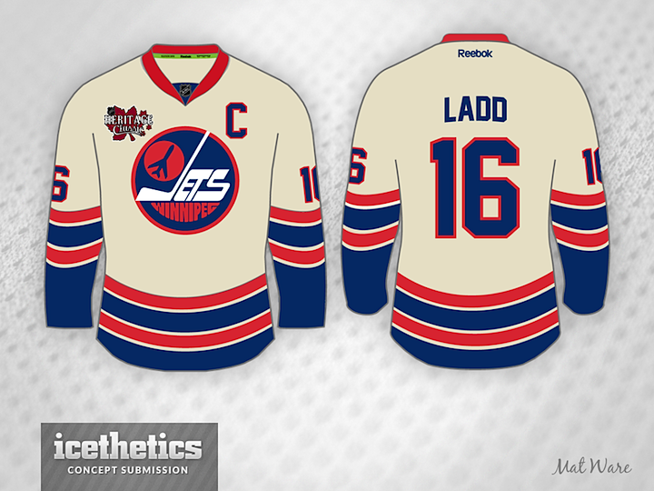
This series wraps up with a Winnipeg Jets fauxback, not unlike what the Flyers wore for their last Winter Classic appearance. Mat gives them the vintage white treatment alongside their original WHA logo to give the NHL's newest team a feeling of history. Which of the three do you like best?

Friday
Sep272013

0588: Freak Outs by Ryan Yuck

Our theme week continues into this Freak Out Friday with the guy you might call the King of Freak Outs. Ryan Yuck's tendency toward the unfamiliar can be jarring at times. You could never call his work bad, but it's definitely out there. Like this re-imagining of the Islanders' fisherman jersey — without the fisherman or the wavy stripes.

Here he merges the Canucks with the old Vancouver Millionaires. It's a strange idea for a hockey sweater, yet there's something about it you can't help but like. Maybe it's the green.

Speaking of green, Ryan's Wild concept takes a little inspiration from the Minnesota club that preceded it — the North Stars. His work is definitely creative and worth taking the time to look at, but I'm not sure I'd necessarily want to see it on NHL ice. What do you think?

Thursday
Sep262013

0586: By Brian Brideau

In this week of featuring some of Icethetics' most prolific concept designers, we come to an artists who's been submitting work to the site for as long as I can remember. And he's always thinking outside the box. First up, he's got a Flyers concept inspired by the first third jersey of their in-state rival, the Penguins.

After the Coyotes unveiled their third jersey in 2008, they posted some of the unused logo designs that were considered. Brian borrows one of those logos for his Phoenix concept.

Finally, it's not the first time we've seen the Penguins in blue, and it almost surely won't be the last. But with the '90s logo? That's a bit out of place. But it makes for a very cool (pun!) sweater design.

Wednesday
Sep252013

0585: By Dylan Alexander

Dylan Alexander is a frequent contributor with a distinct style and he's the next to be featured in this special week of concept posts. First we get a look at some third jersey options for the Blackhawks.

Next, we have Dylan's attempt at fixing the Hurricanes' new uniforms. He proves it's really a simple task. Put the storm flags back!

As a bonus, here's a college concept for the University of North Carolina. Dylan's done an awesome job giving the Tarheels a makeover. Looking forward to seeing what he tackles next.

Tuesday
Sep242013

0584: By Nick Burton

Continuing our week of featuring prolific artists is Nick Burton. Last week he wrapped up his WNHL series. Today we get a glimpse at some NHL jerseys, including this very green Canucks set. Not for nothing, but I would buy that in a heartbeat.

He's got a sharp fauxback for the Kings as well. I could see a grey jersey working very well if it was executed this way.

Lastly, he's putting the Bolts back in black but with the new logos. I'm not sure it needs all the stripes, but I'm looking forward to an eventual black third jersey in Tampa.

Monday
Sep232013

0583: By Bastian Schmülling

I'm launching a brand new theme week today! We have so many artists who are so prolific that I thought they deserved their own week right before hockey season starts. So each day we'll feature a trio of concepts from a specific designer, starting here with Bastian Schmülling. His Wild jerseys may look a little dingy, but they also look like instant classics.

The Flames could use a uniform simplification and Bastian has the perfect answer and the best use of black I've ever seen on a Flames concept.

Finally, the Ducks need a way to distinguish their palette from the Flyers and that gold just isn't cutting it. So how about green? Not the first time we've seen green and orange combined in an Anaheim concept, but certainly among the better examples.

Bastian still has a ton of work that's gone unpublished to date, but I'm working to rectify that. He's got a great eye for uniform design and I, for one, am always excited to see what new ideas he's come up with.

Sunday
Sep222013

0582: Seattle Ravens

Here's a cool one for Seattle Sunday. Brandon Manzione introduces the Seattle Ravens. The only problem I could foresee is when this team plays the Philadelphia Flyers. Lot of similarity in logo style there, but otherwise a really sharp concept.