Saturday
Sep072013

0567: Team Canada in Sochi

Skipping our Winter Classic Saturday series today for something more timely. On Thursday night, the world got a sneak peek of what may be Team Canada's 2014 Olympic jersey. With that in mind, a few concept artists have toyed with the idea. Francis Matte has a revised version of the red sweater along with a white one to match.

Adam Ravenhill decided to stick with the Nike design for the red jersey and also add a white version. Any chance the maple leaf in the middle of that one could be white? Or is that sacrilege in the Great White North?

And now for something completely different. Devin Durocher submitted this one last week, prior to Thursday's leak. He writes: "It's very simple with a few accents. There is a gold 8 in the V of the collar for the 8 golds Canada has won at the Olympics. Also inside the collar at the back of the neck it says TRUE NORTH."

Thoughts on these designs? Are you worried about the official unveiling of Canada's sweaters?

Friday
Sep062013

0566: Pennsylvania Freak Out

I don't even want to explain why this 2015 Winter Classic concept by John Elbertson belongs on a Freak Out Friday. It's more fun if you look at it a minute and realize on your own.

Thursday
Sep052013

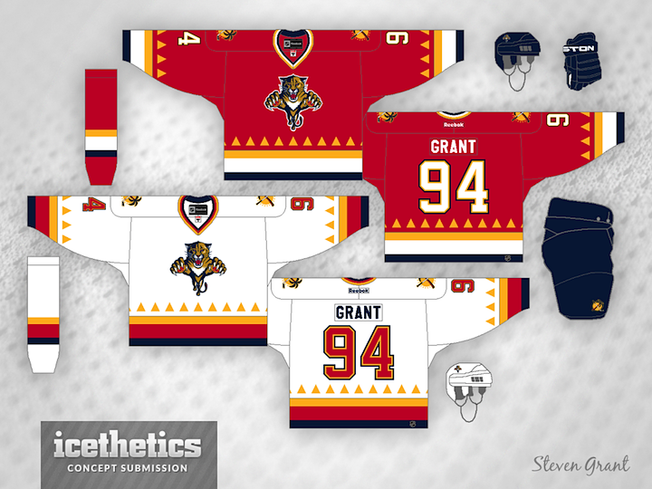
0565: Straight From Sunny Florida

Steven Grant has made one of the sunniest hockey sweaters I've ever seen. These Panthers jerseys were inspired by the sun featured in the club's secondary logo.

Wednesday
Sep042013

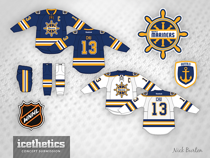
0564: The WNHL Series, Part 4

We're up to the fourth team in Nick Burton's fictional Women's National Hockey League. Introducing the Buffalo Mariners. They join the Montreal Royals, Boston Irish and Toronto Metros. Two more to go. Any guess which cities will be represented?

Tuesday
Sep032013

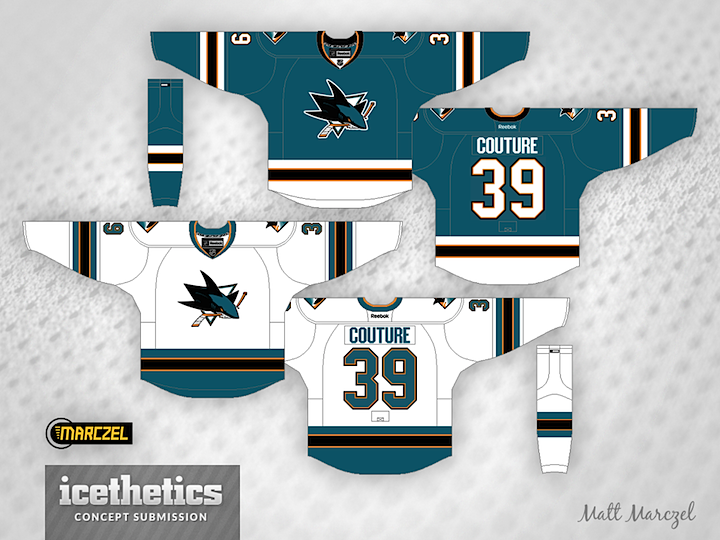
0563: Fixing the Sharks

The San Jose Sharks' new uniforms got pretty mixed reviews when it was unveiled. And plenty of readers had suggestions for how they could improve them. To that end, I have a couple of great ideas to share today. First, our hero of hand-drawn art Morgo Uxbridge proves shoulder yokes aren't a dealbreaker, but you really need something in the waist area.

And regular contributor Matt Marczel proves the same, but in a different way. Kind of a bummer looking at these and seeing what the Sharks missed out on.

Monday
Sep022013

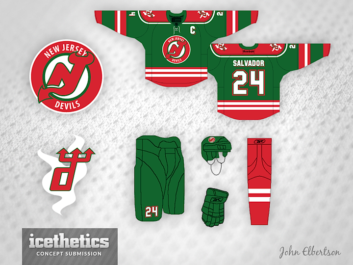
0562: A Third Jersey for New Jersey

After a week's worth of Wild hubbub, you're probably a tired of green and red. So naturally I've decided to give you more of it. Seriously though, I think John Elbertson has put together a snappy Devils third jersey concept. New Jersey's higher-ups may not be interested in alternate uniforms, but let's not forget the Devils are going to need something for when they venture into the outdoors this winter.

Tomorrow, we look at ways of fixing the Sharks' boring new sweaters. (Hint: We're ignoring the players' "weight" complaints.)

Sunday
Sep012013

0561: Nevermind the Early Release

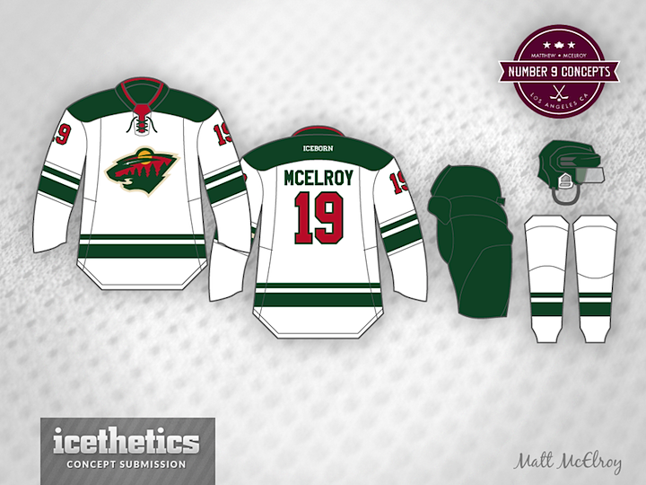
Well, we're not going to let some early release rain on our parade, are we? The Wild's new road jersey showed up in official photos on their website late last night, but that won't keep me from showing some concepts anyway. Like this one from Matt McElroy, who came the closest to getting it right. Nobody planned for the squared off shoulder yoke though.

Brian Brideau has a habit of being right about these things and he too came pretty darn close. I like his take on the unlayered, solid color numbers. Gives the jersey that old-timey feel.

And Michael Baumann, well he's been here before. He submitted a concept back in January awfully similar to this. Talk about psychic, right? All three of these concepts were submitted prior to last night's reveal so they're all legitimate guesses.

No offense to these talented guys, but I'm mighty impressed with what Minnesota actually came out with. I don't think it needs to be improved upon. You?